Branding
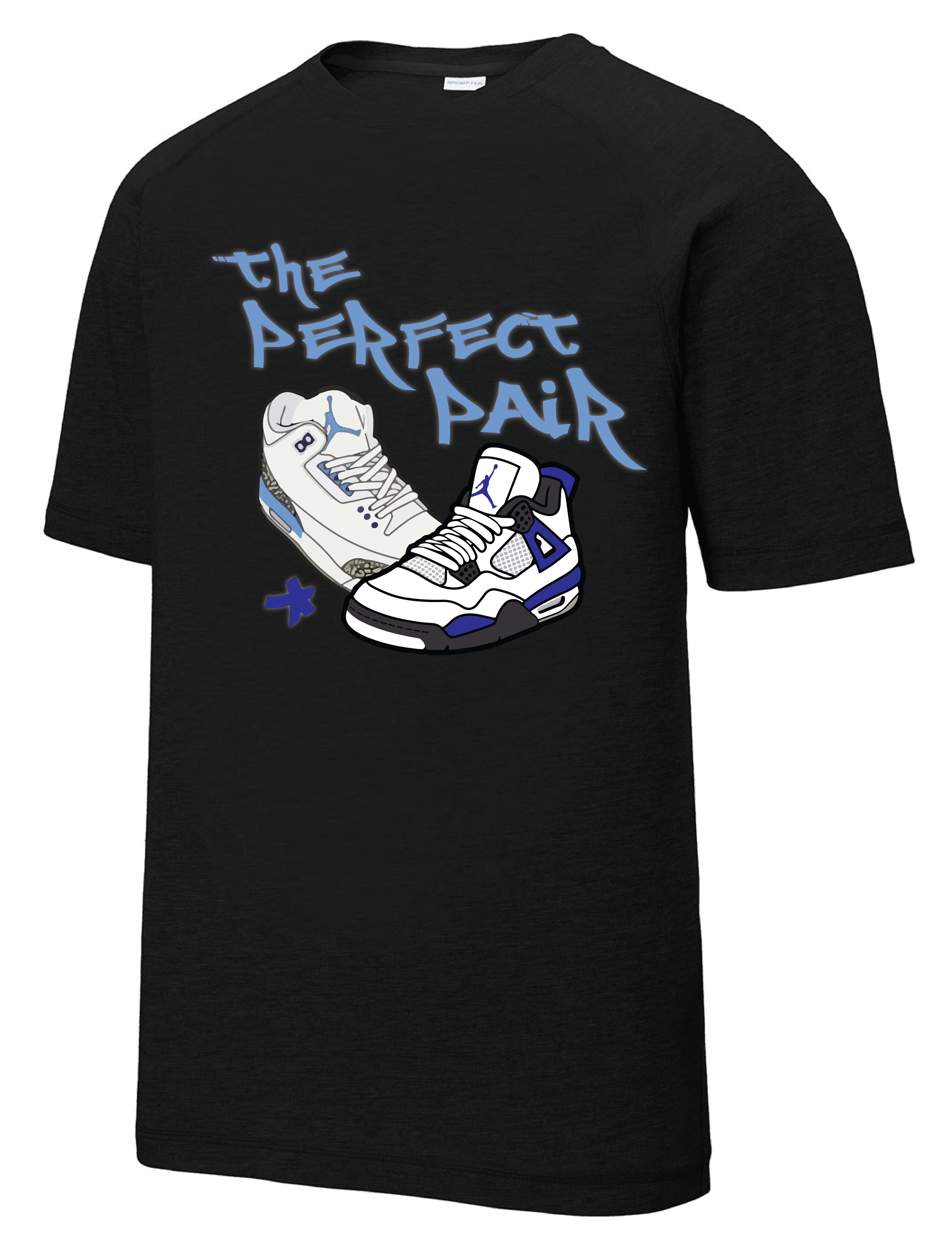
The Perfect Pair
Created a one-of-a-kind tribute T-shirt in honor of a sneaker collector with one of the world’s most impressive shoe collections. Designed as a heartfelt tribute for his brother’s birthday, the shirt features a custom Jordan-inspired logo that reflects his passion for sneakers and lasting legacy. Thoughtful details and meaningful design elements celebrate his influence and love for the culture, ensuring the piece serves as both a statement and a cherished keepsake.
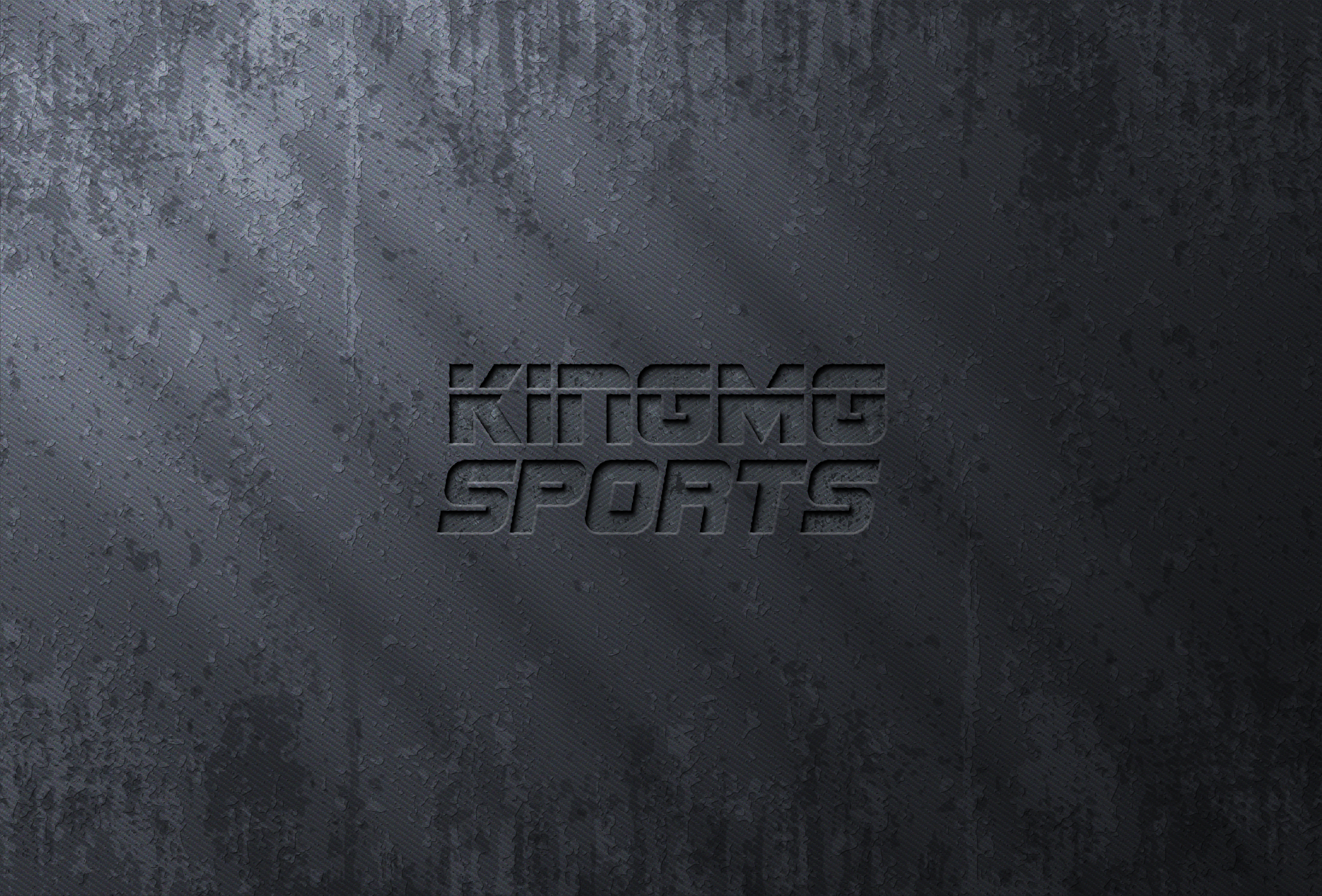
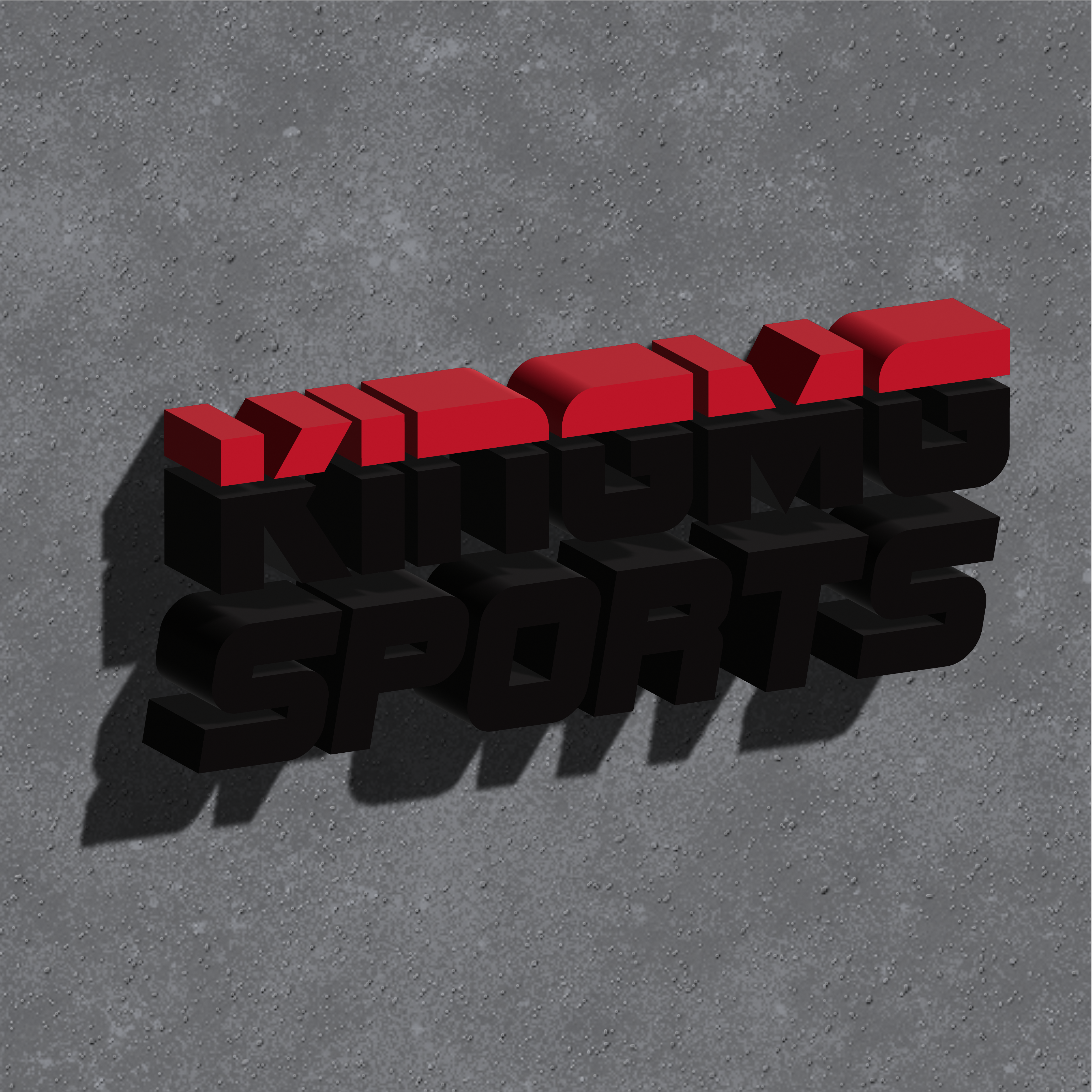
King MG Sports
Designed a bold and dynamic logo for King MG Sports Management, capturing the brand’s essence of strength, professionalism, and elite athletic representation. The logo features a modern, sleek design with a regal touch, incorporating elements that symbolize leadership, ambition, and excellence in the sports industry. By balancing strong typography with refined visual elements, the final design ensures versatility across various platforms, from digital media to merchandise.
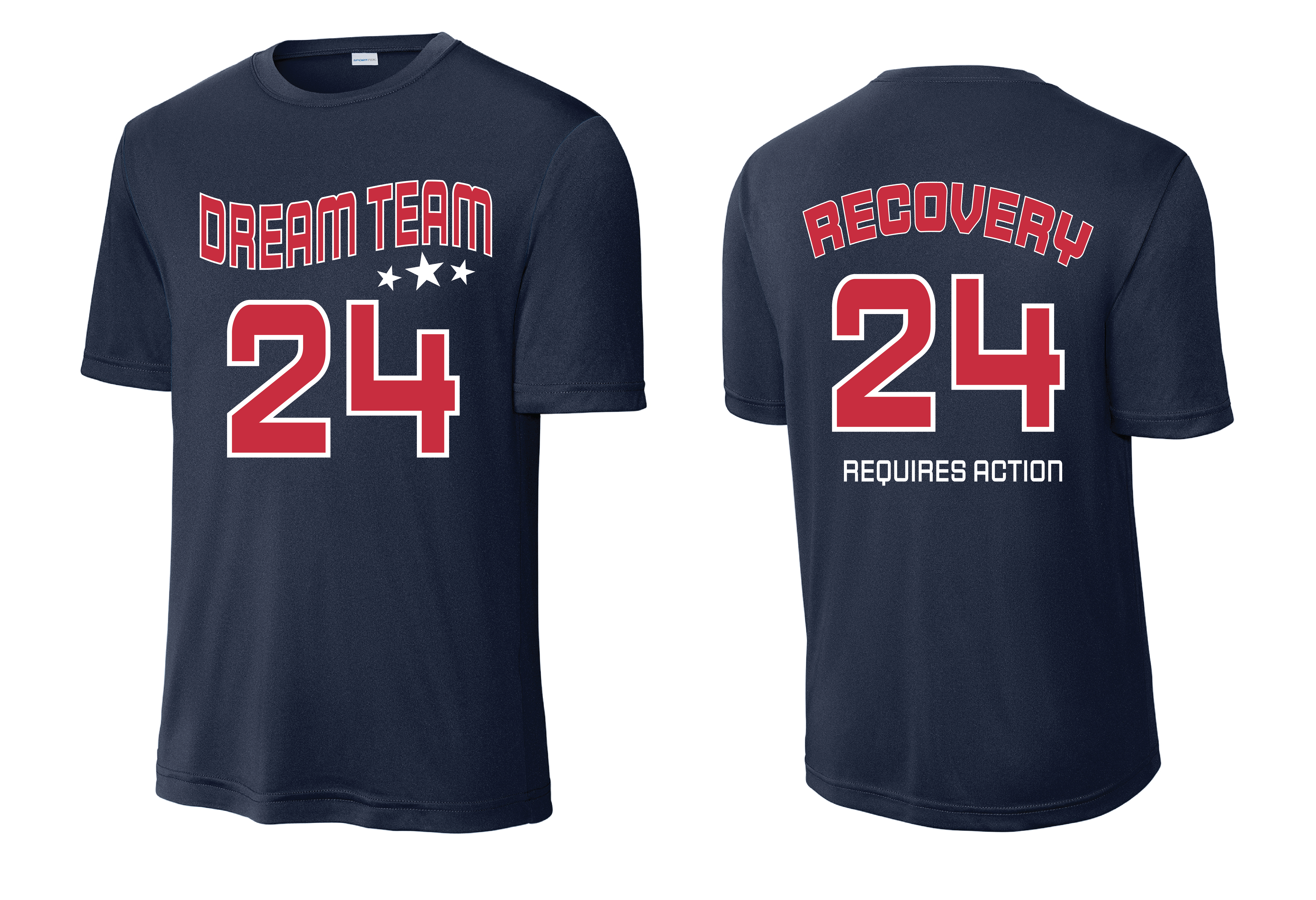
5k Recovery Tee
I designed a custom t-shirt for Soul Solutions’ Recovery 5K event, supporting individuals recovering from various addictions. The design aimed to inspire hope and strength, featuring bold typography that reflects unity and perseverance. The t-shirt incorporates retro style jersey, along with symbols of recovery, progress, and community, offering a wearable reminder of the journey toward healing. Crafted for comfort and durability, the t-shirt is not only a commemorative piece for participants but also serves as a symbol of empowerment and resilience for those overcoming addiction.
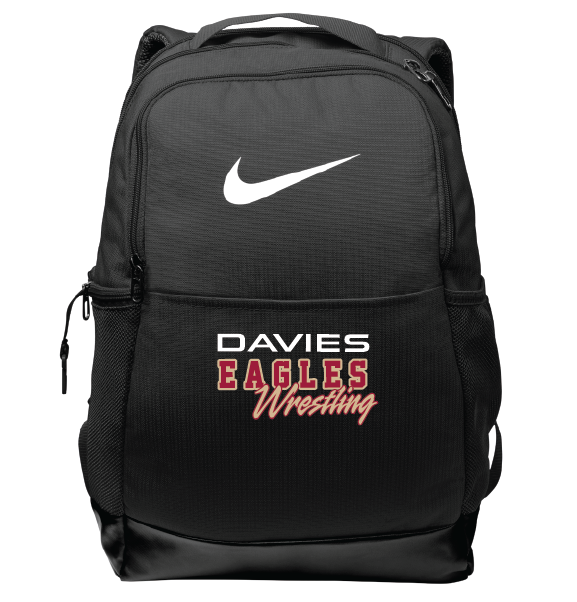
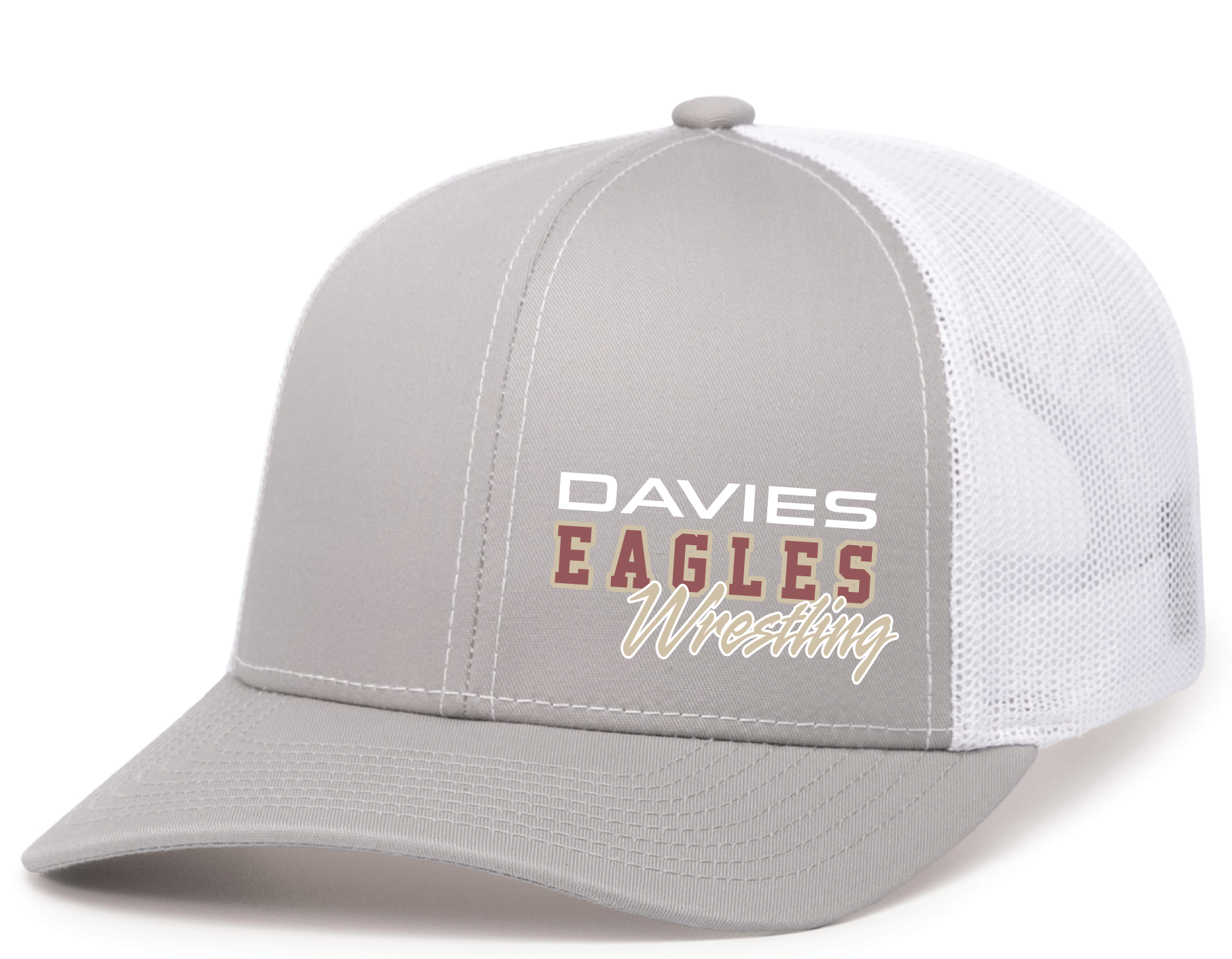
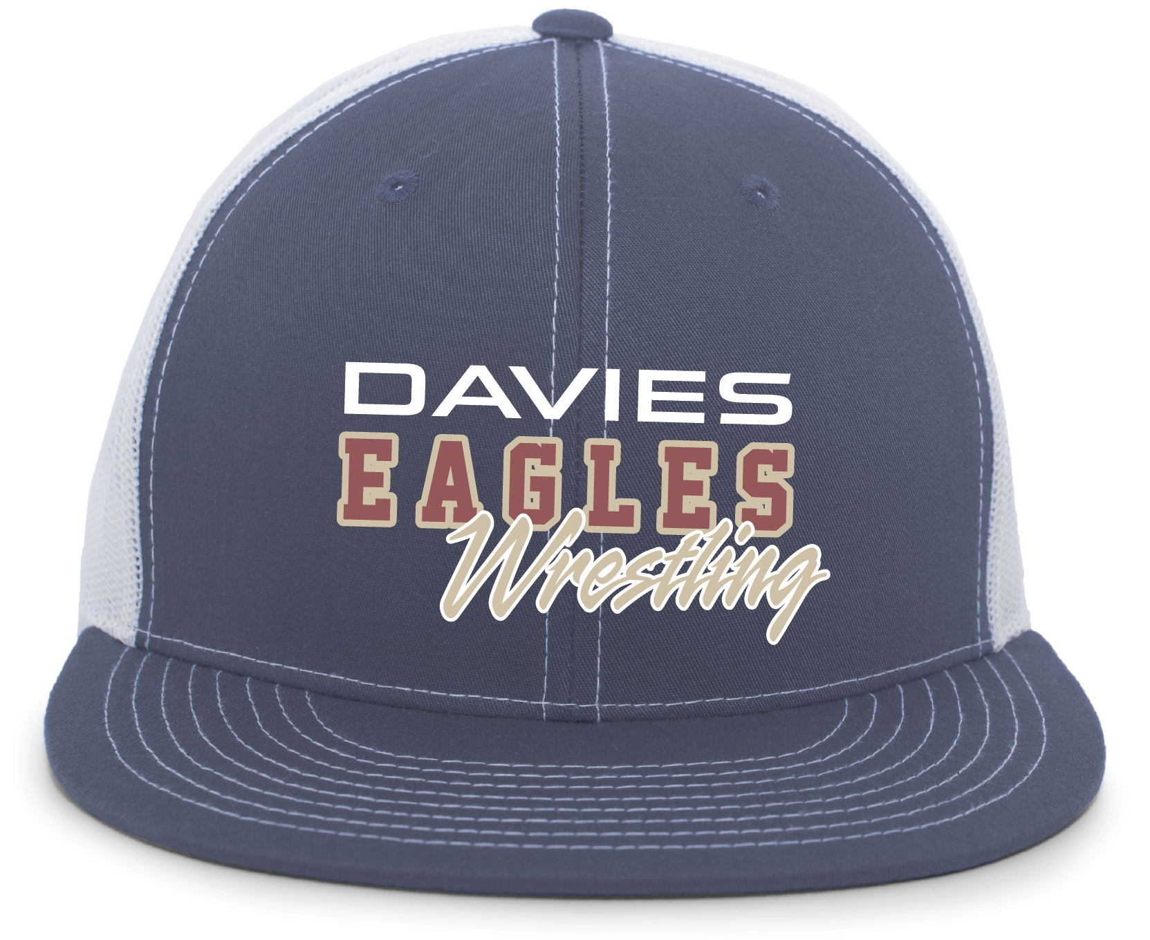
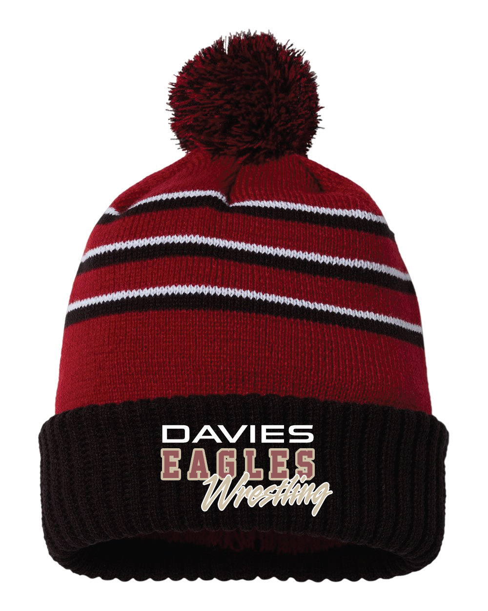
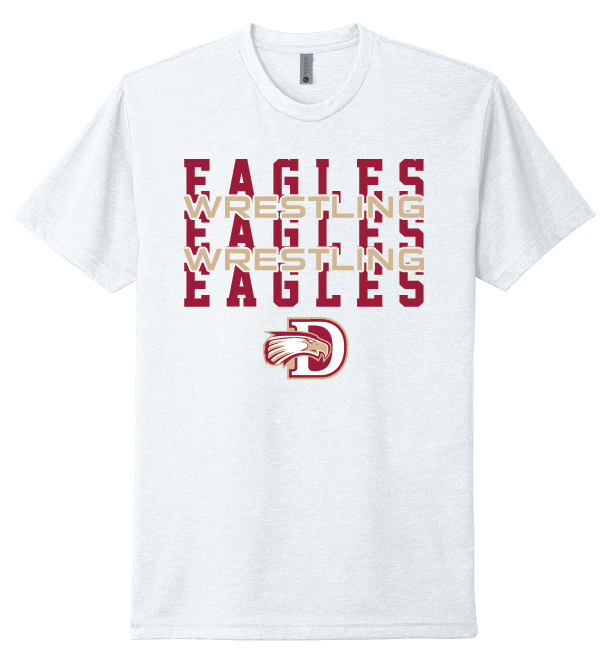
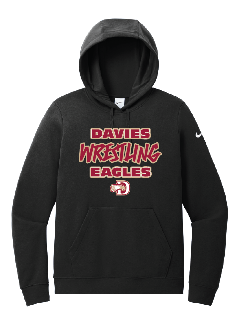
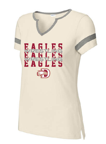
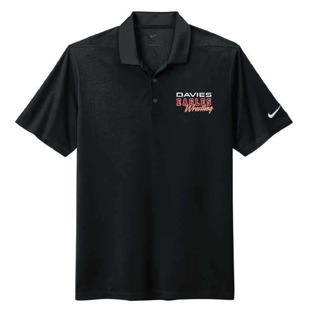
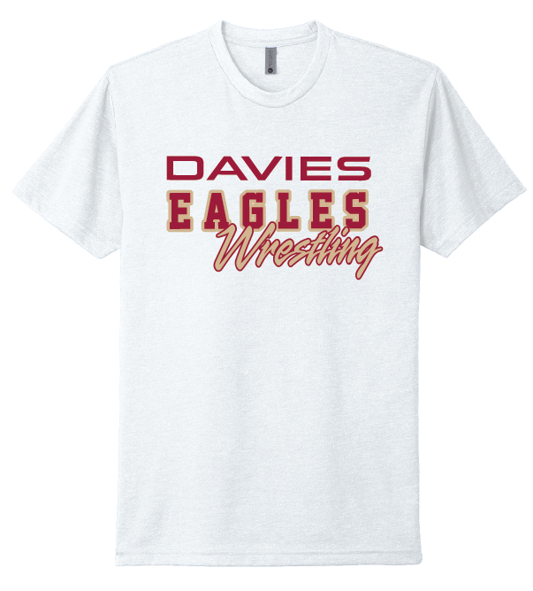
Davies Wrestling
I developed a branding shop for a high school wrestling team, featuring fan and team athletic wear. The collection includes performance gear, such as moisture-wicking shirts, hoodies, and hats, designed with the team’s logo and colors to boost school spirit. The branding reflects the team’s strength, discipline, and unity, offering students, athletes, and fans a way to represent their pride both on and off the mat. The designs balance functionality and style, ensuring that the apparel is suitable for both athletic performance and everyday wear.
True North Church
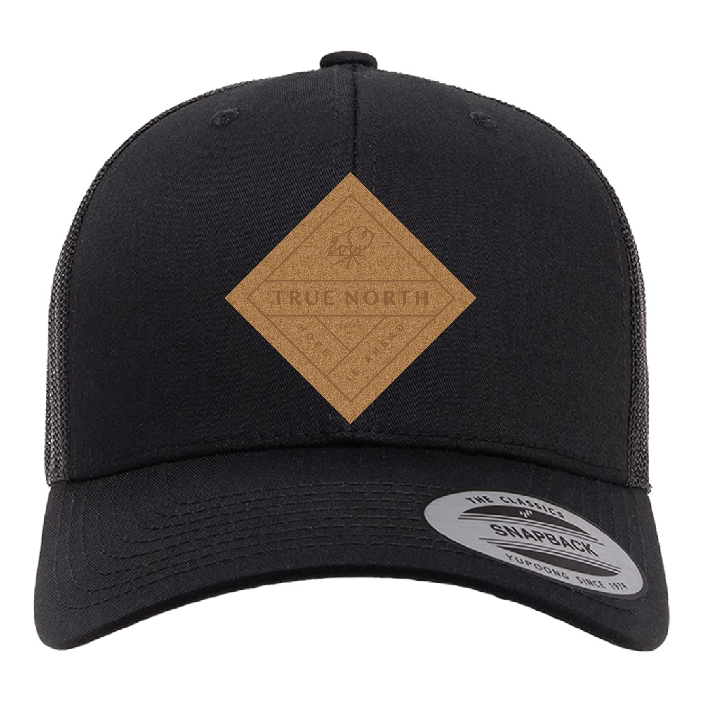
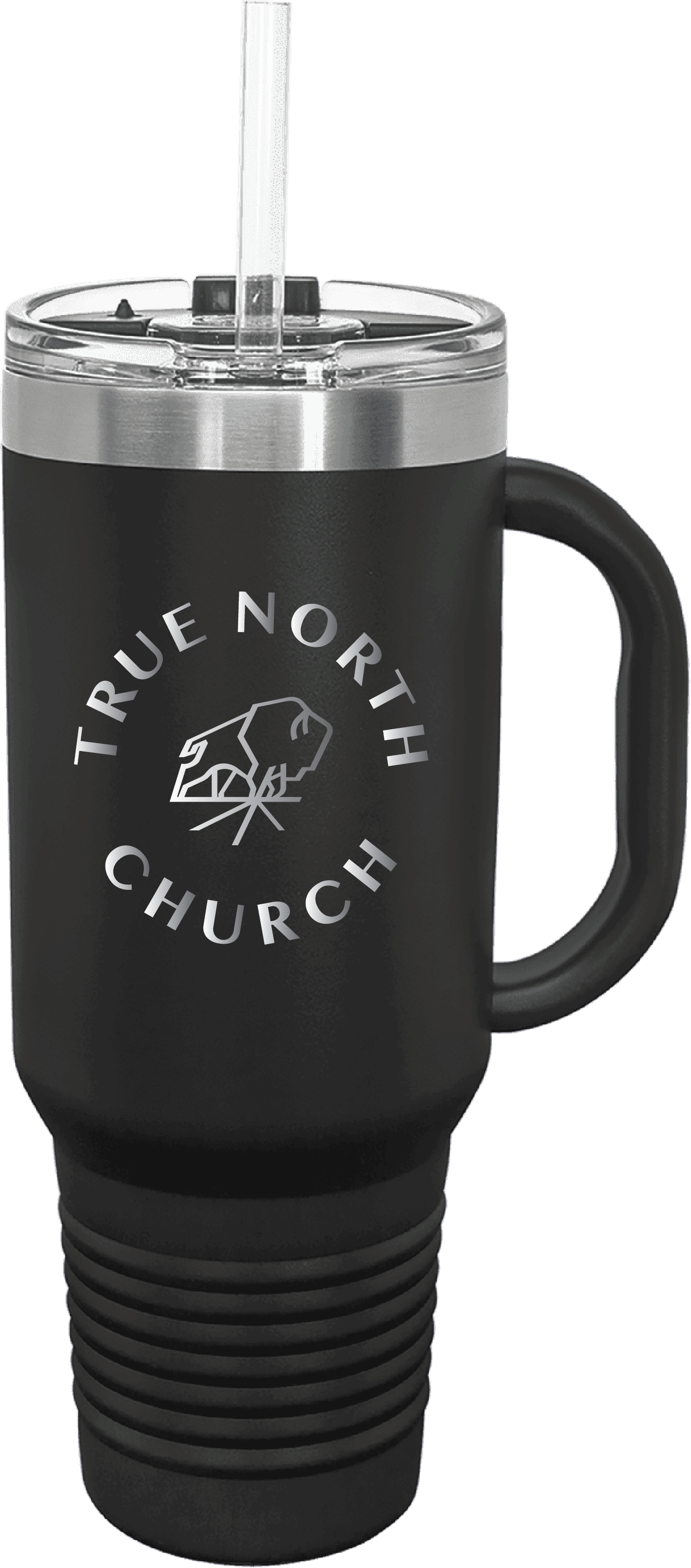
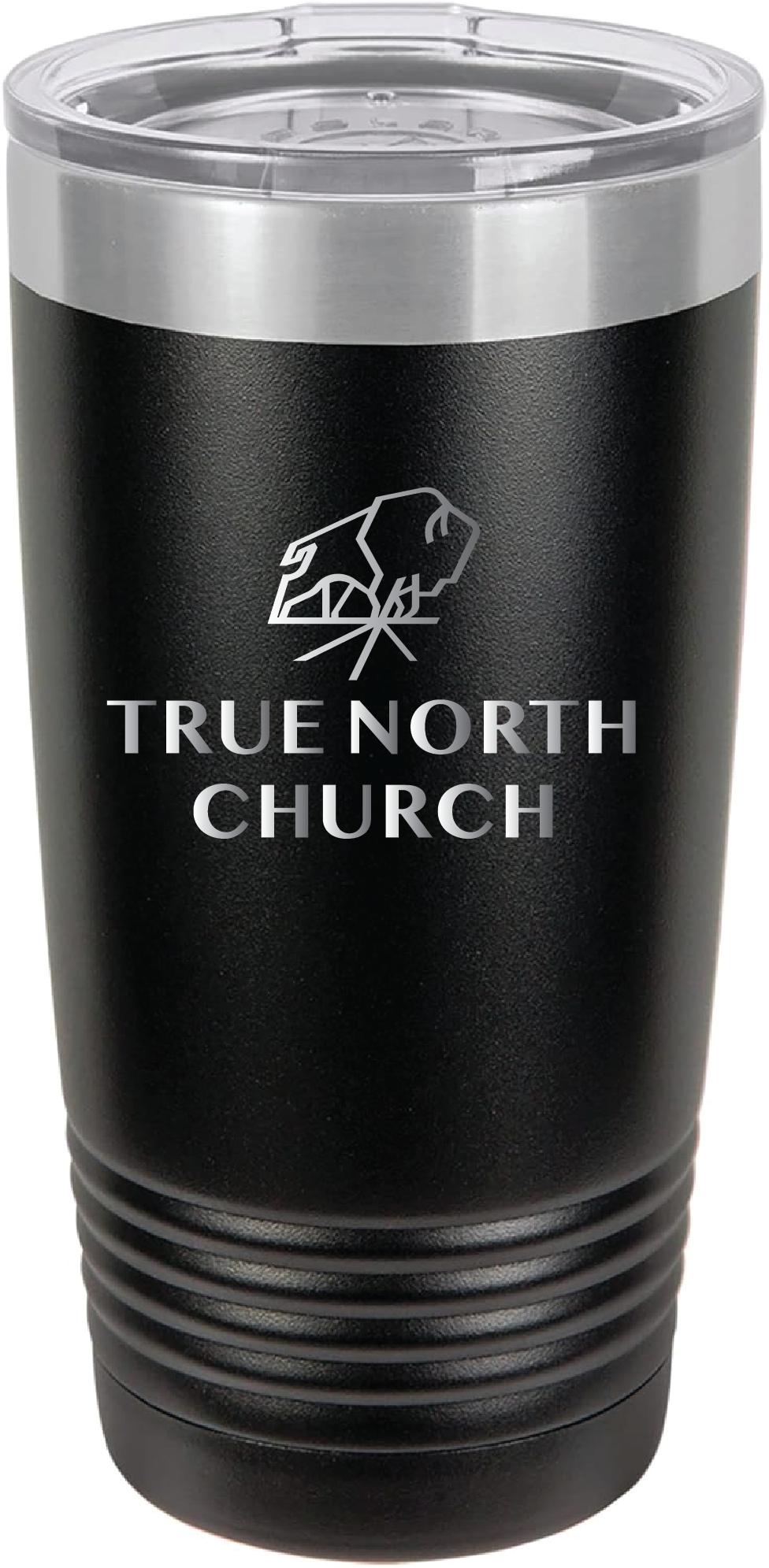
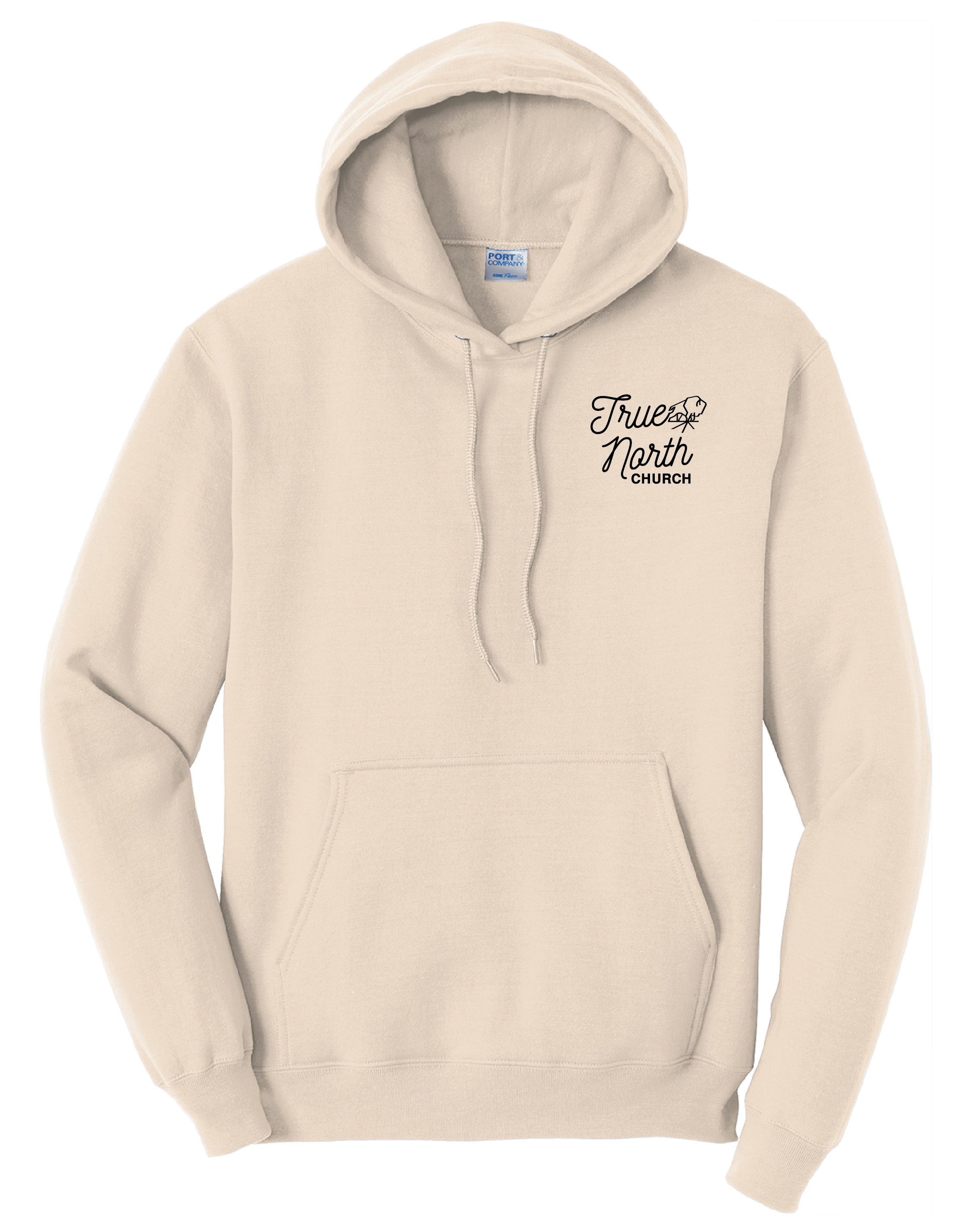
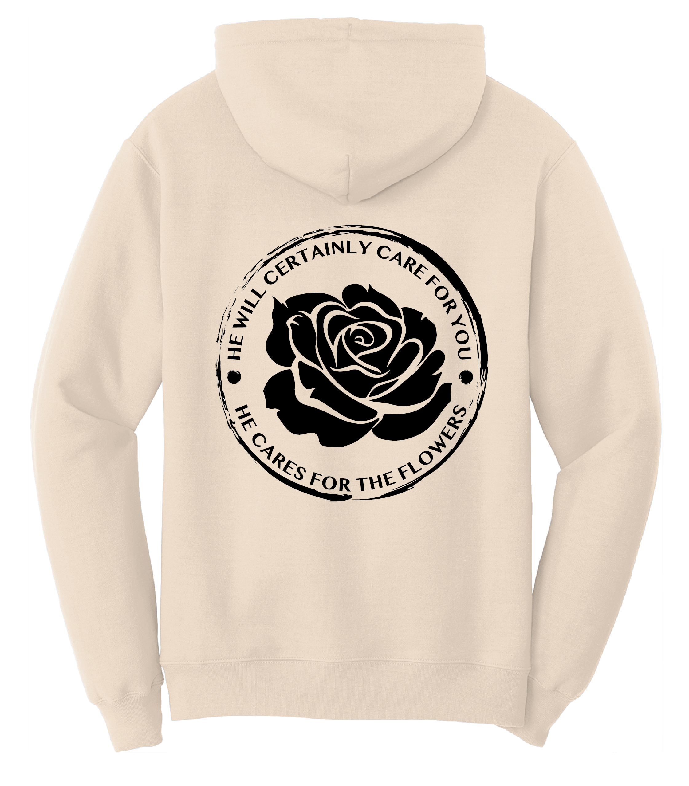
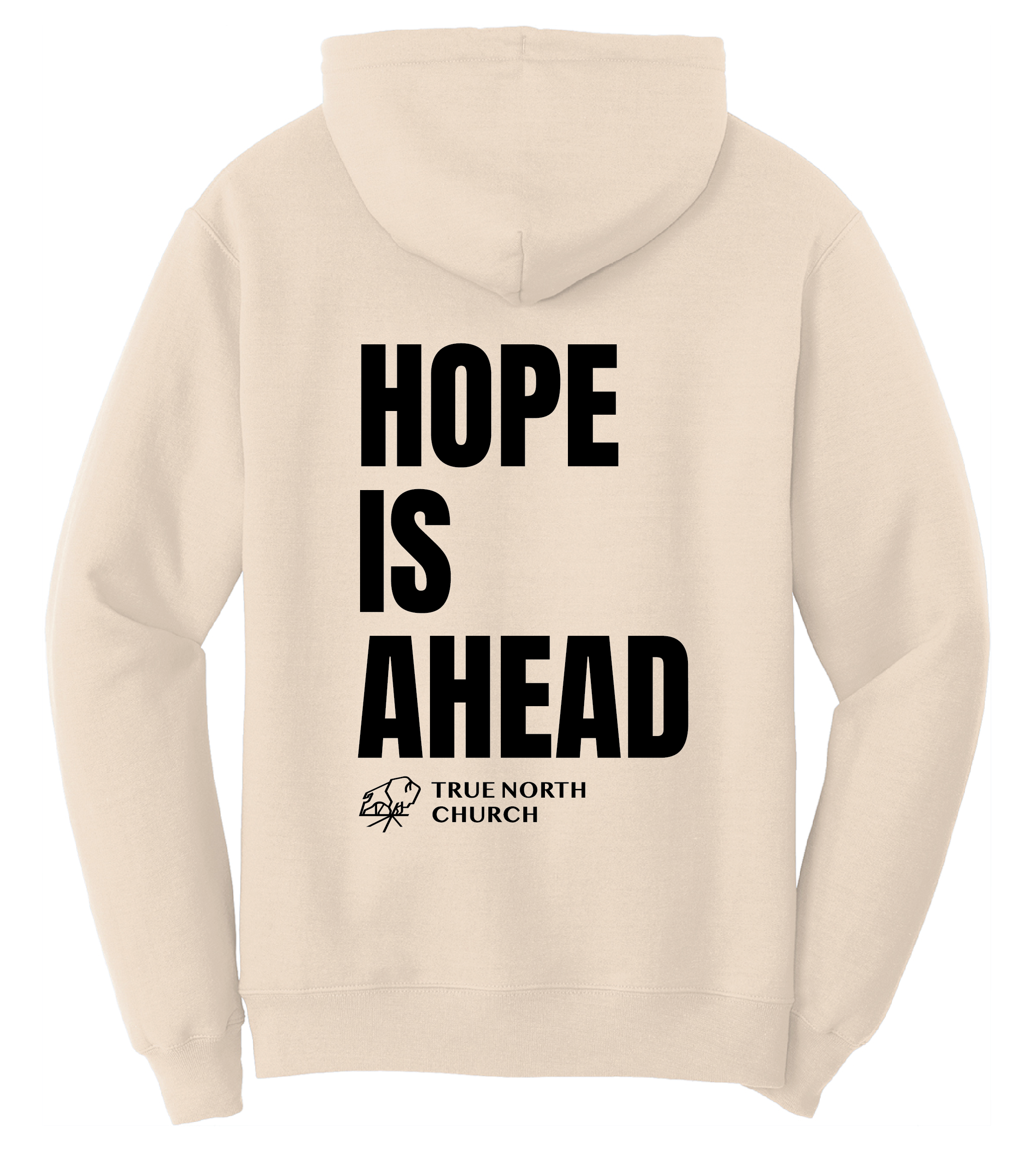
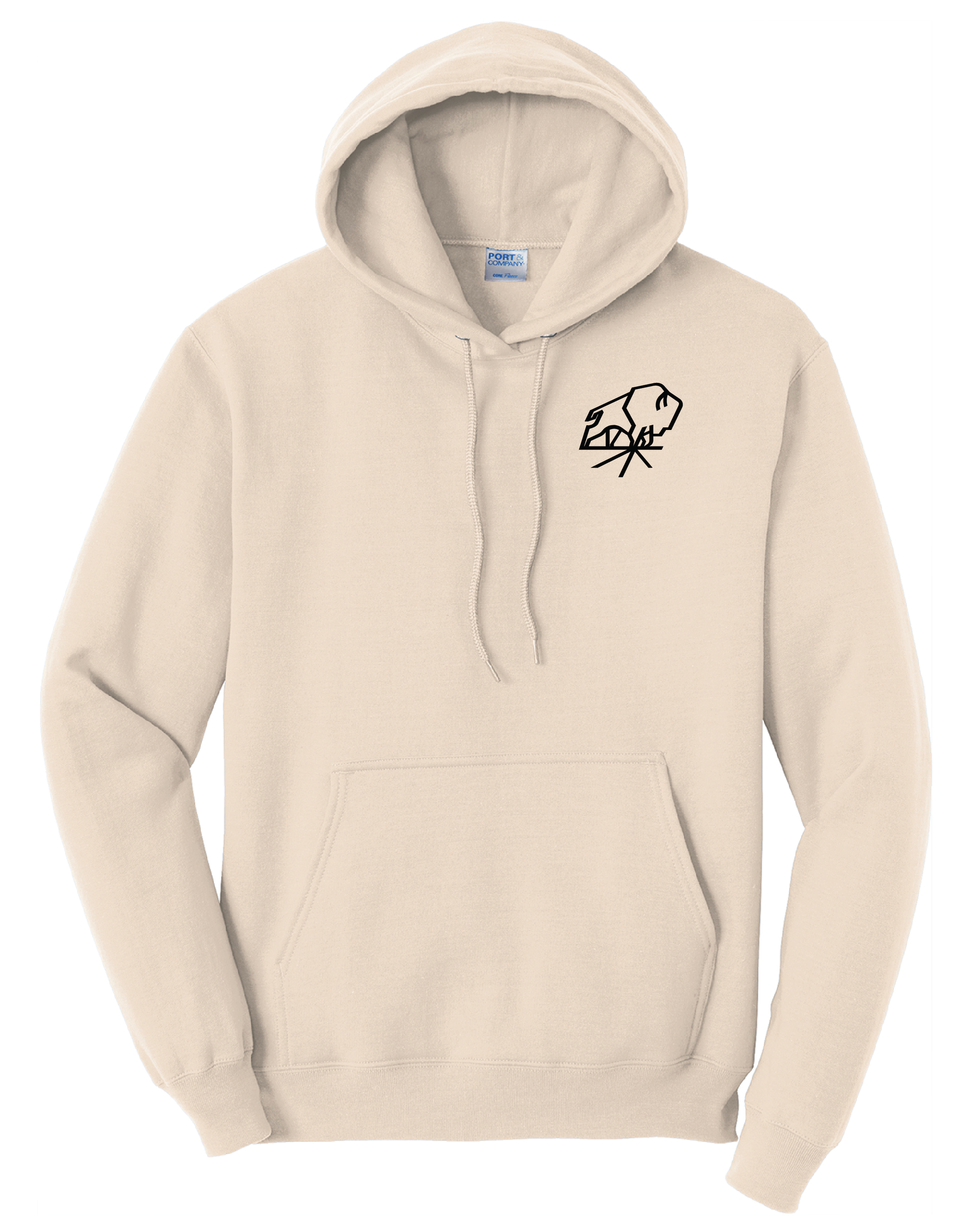
For the rebranding of True North Church, I created a cohesive line of clothing merchandise that reflects the church’s mission and values. The collection includes leather patch hat designs, hoodies, and other apparel, all curated to convey a modern, yet timeless look.
The leather patch hats feature a minimalistic yet bold design, incorporating the church’s logo and color scheme. The hoodies were designed for both comfort and style, making them perfect for both church events and everyday wear. The tumblers are laser etched designs to align with the brand guide. This project brings together practicality and aesthetic appeal, using clean, outdoor-inspired elements that resonate with a broad audience, while maintaining a spiritual connection.
Uplifted
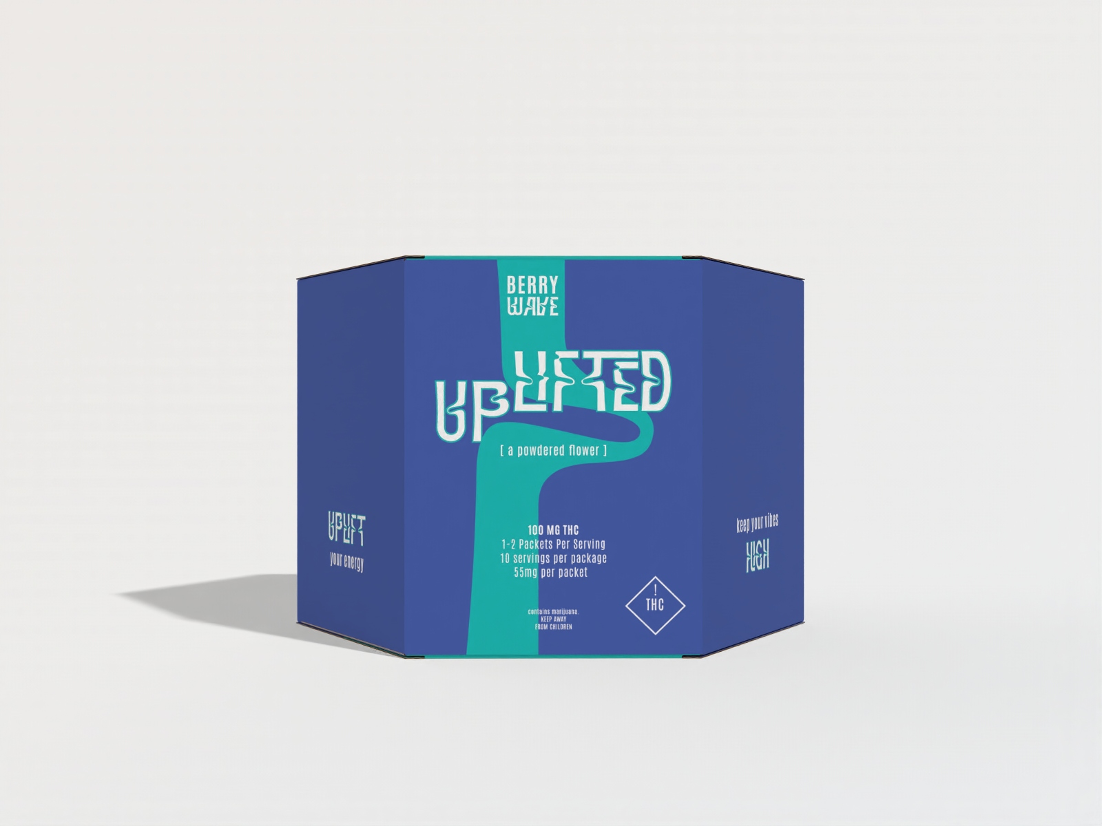
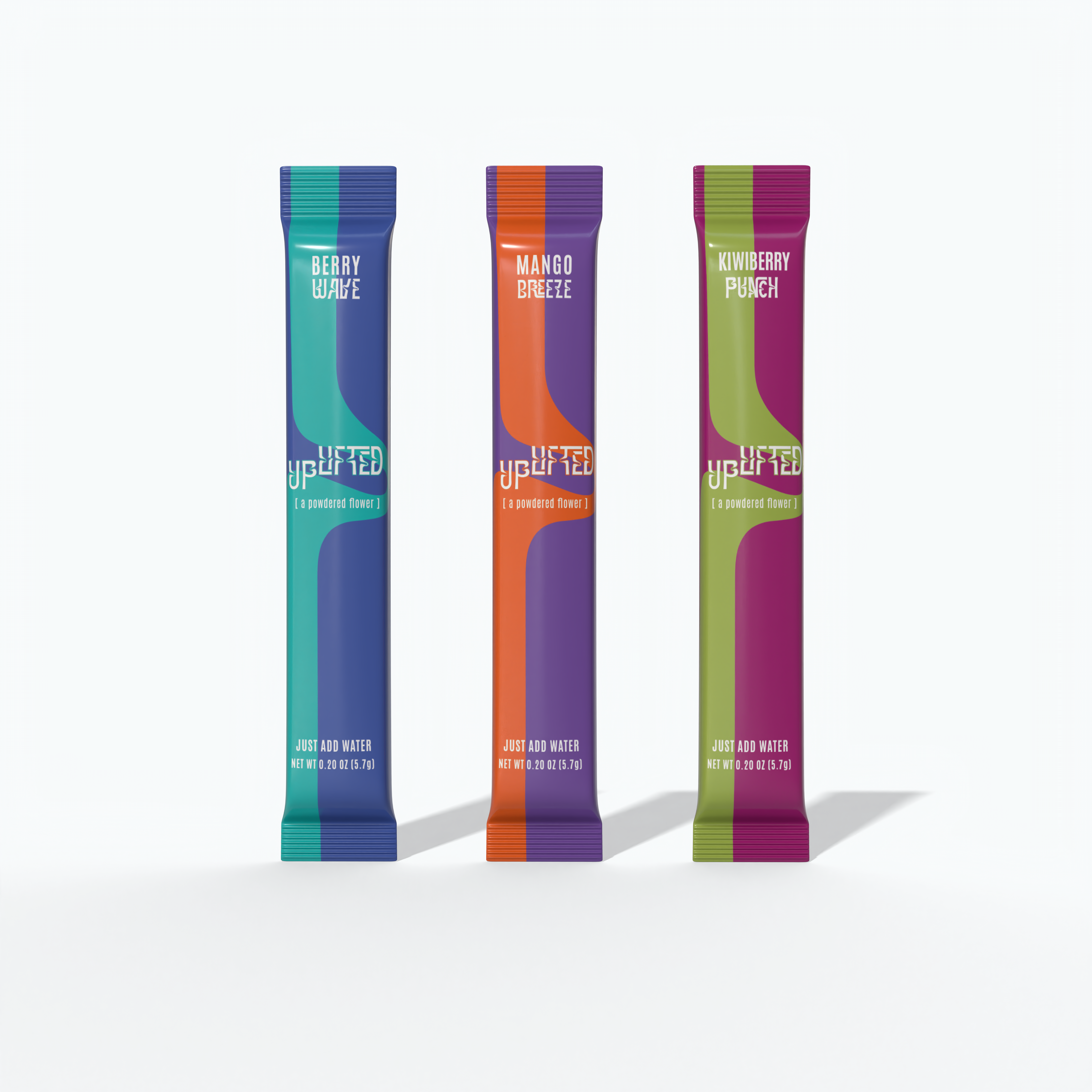
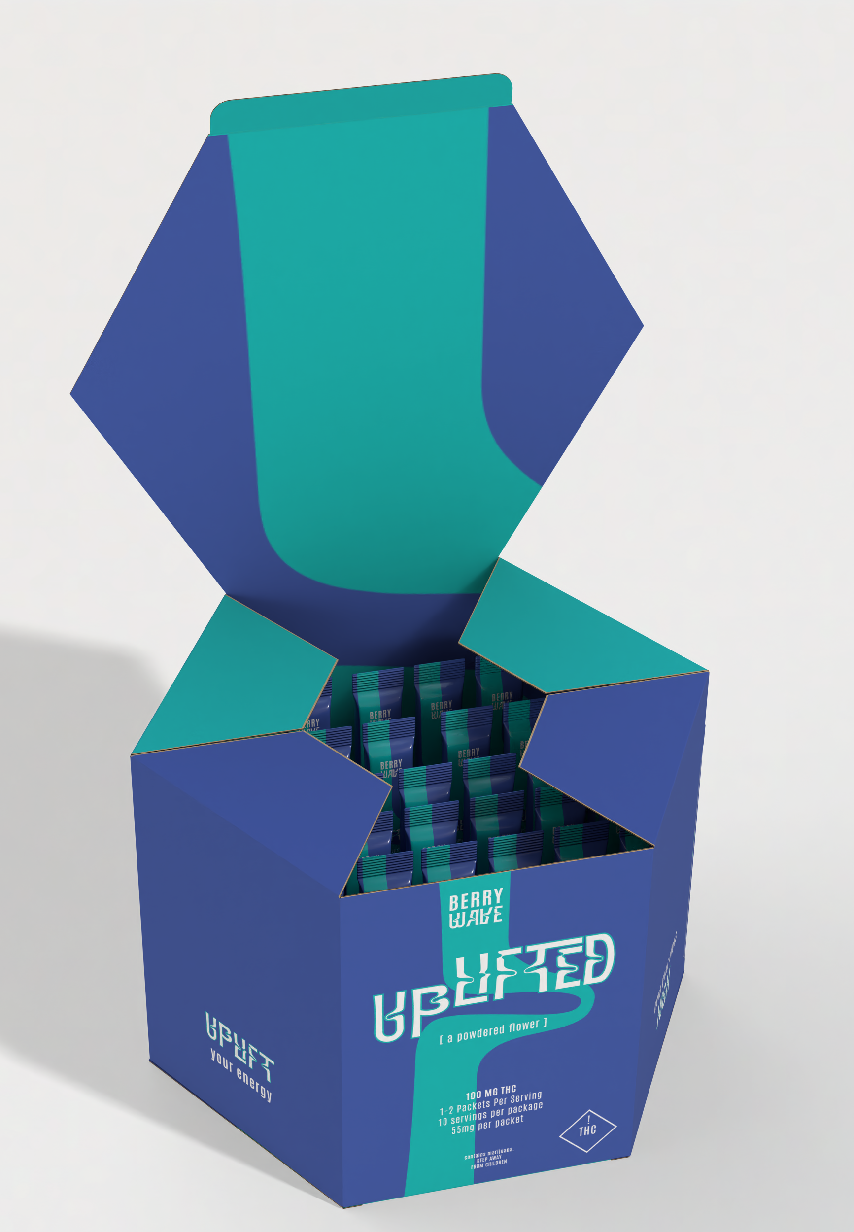
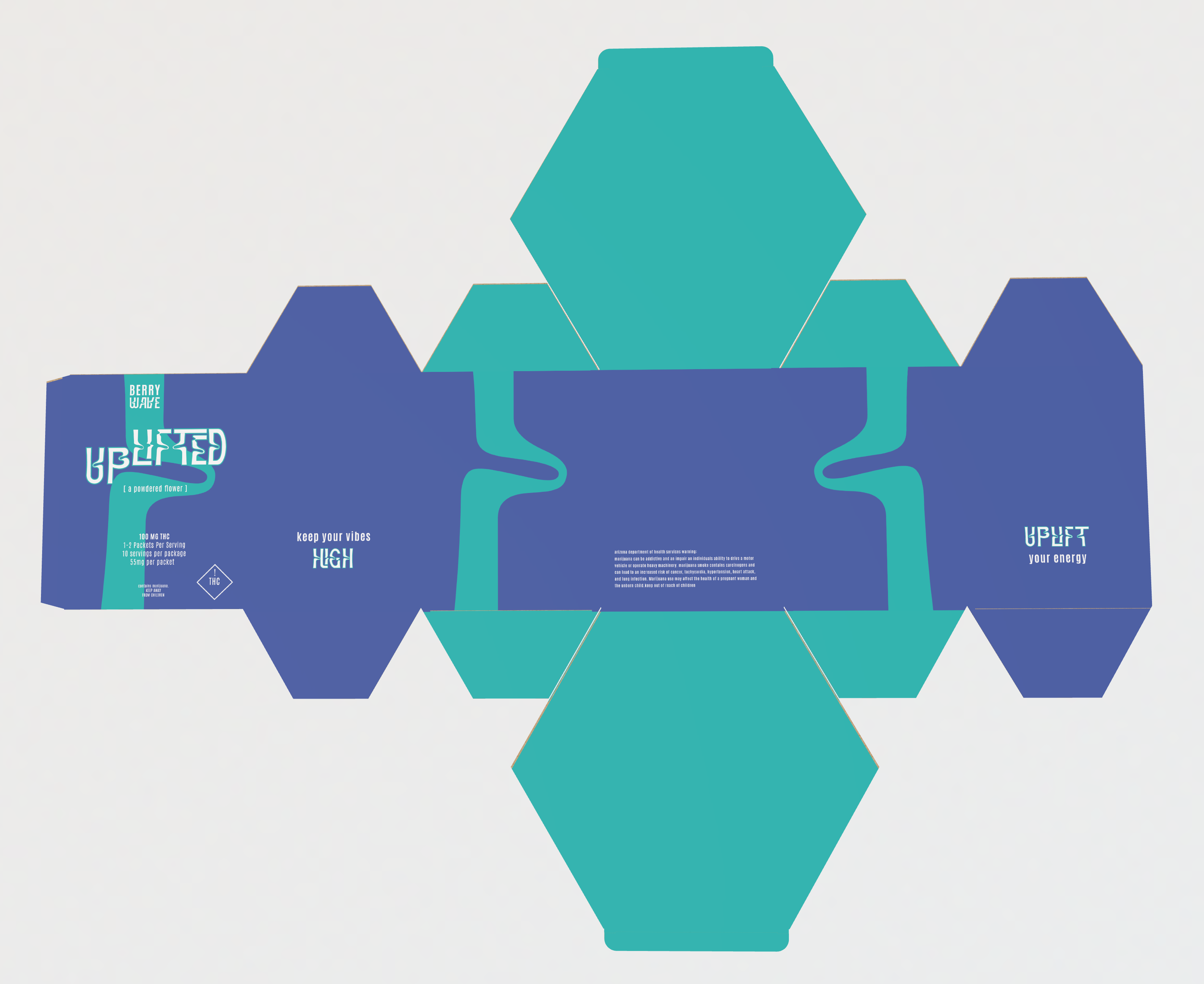
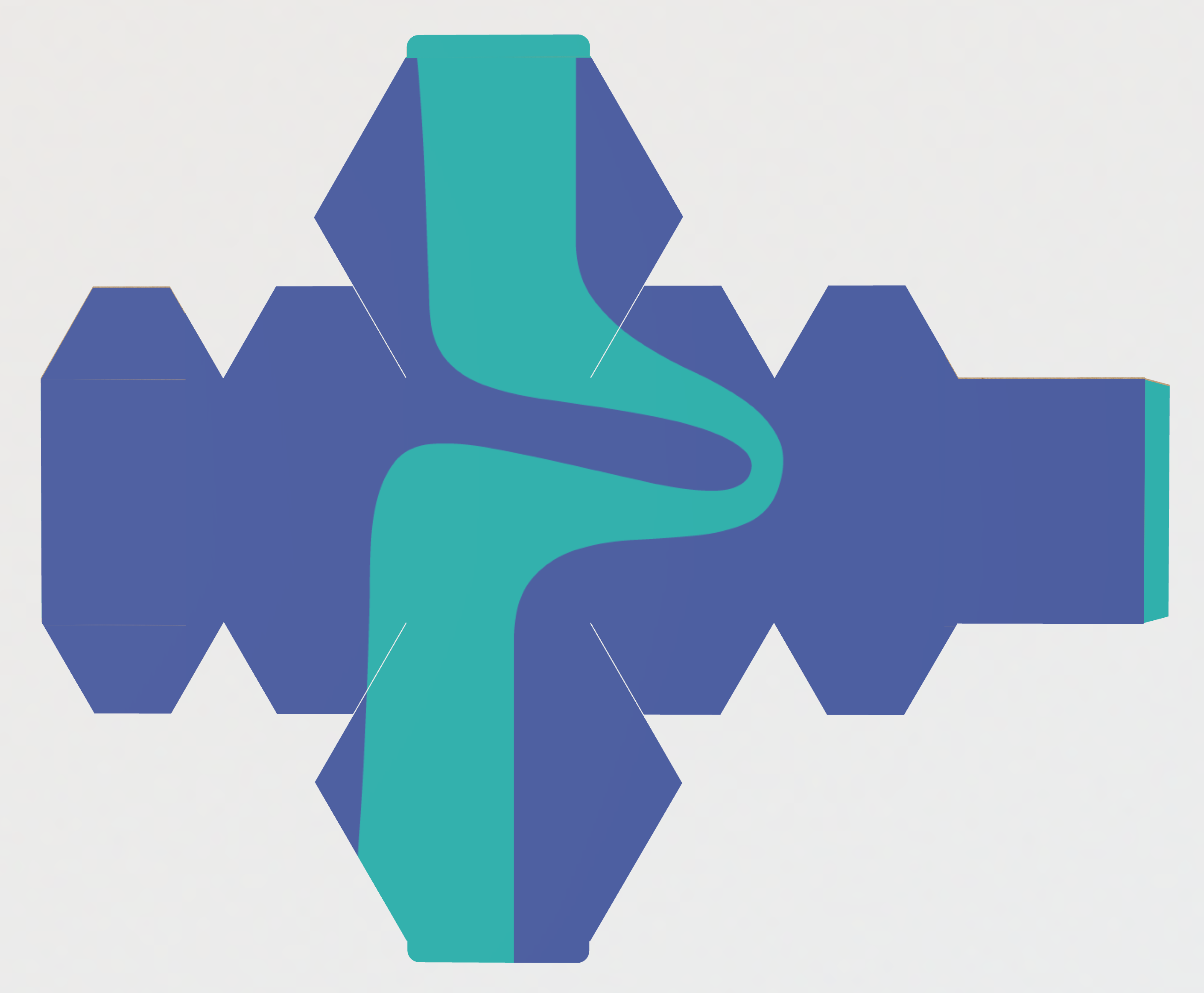
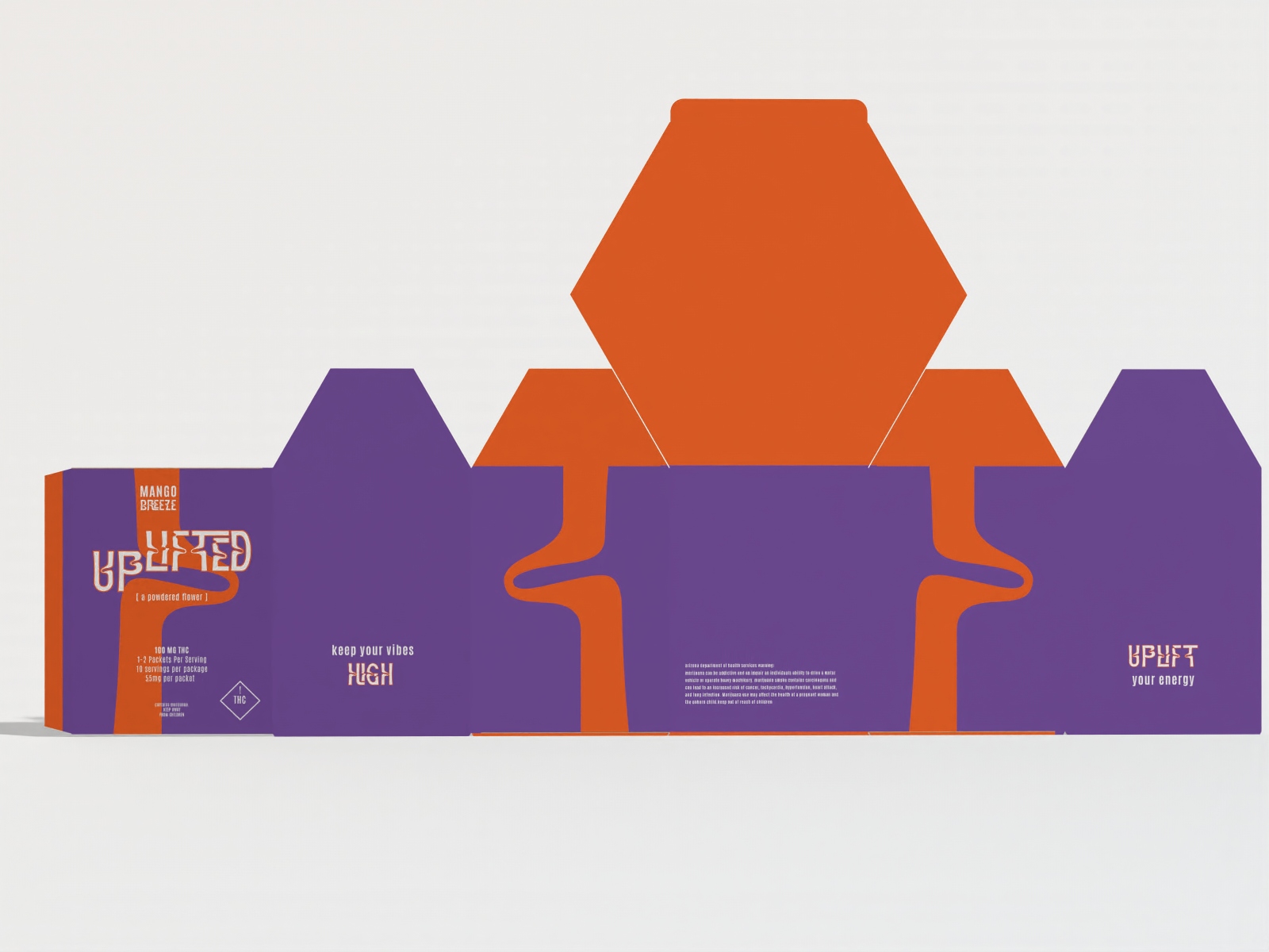
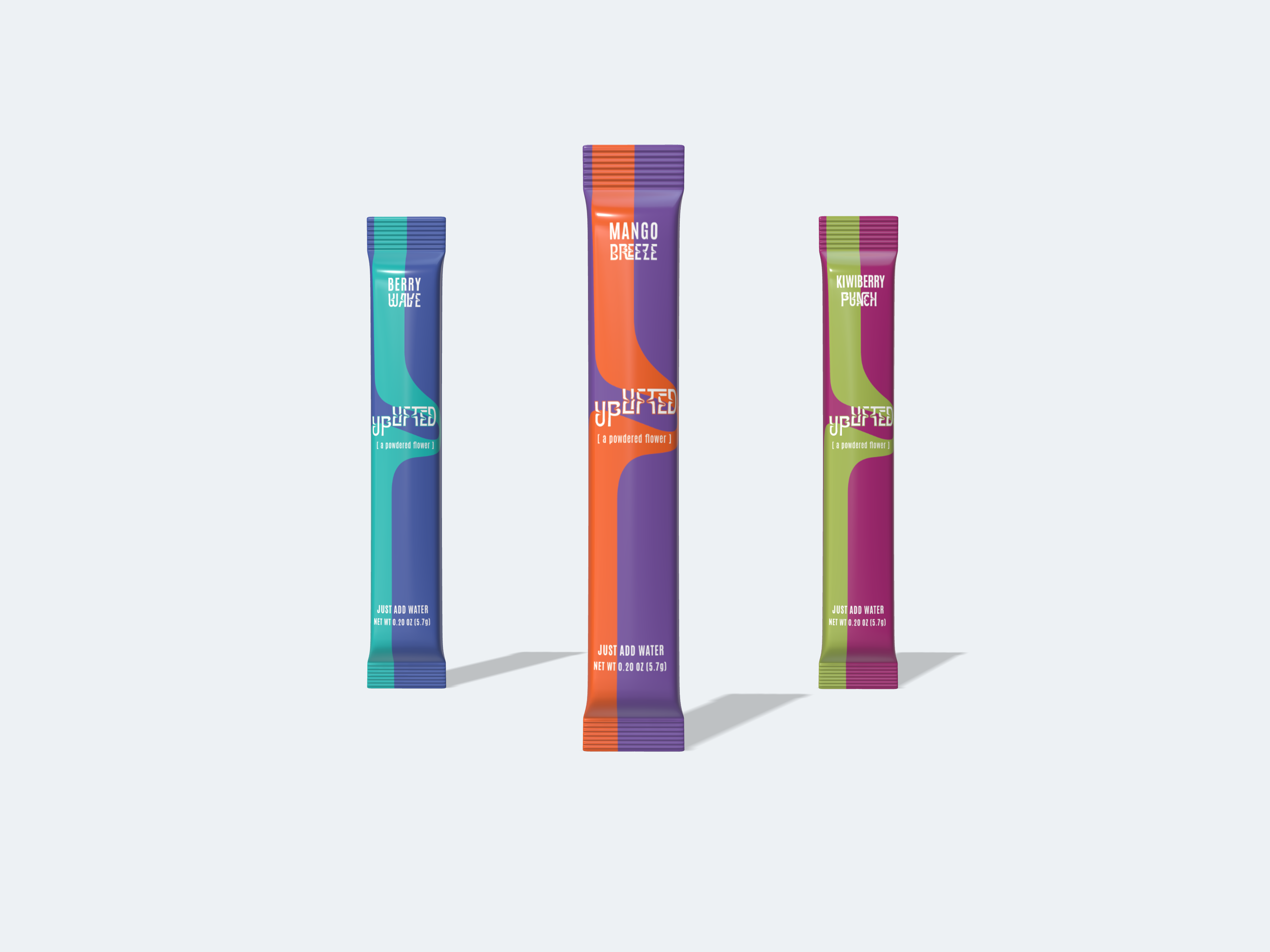
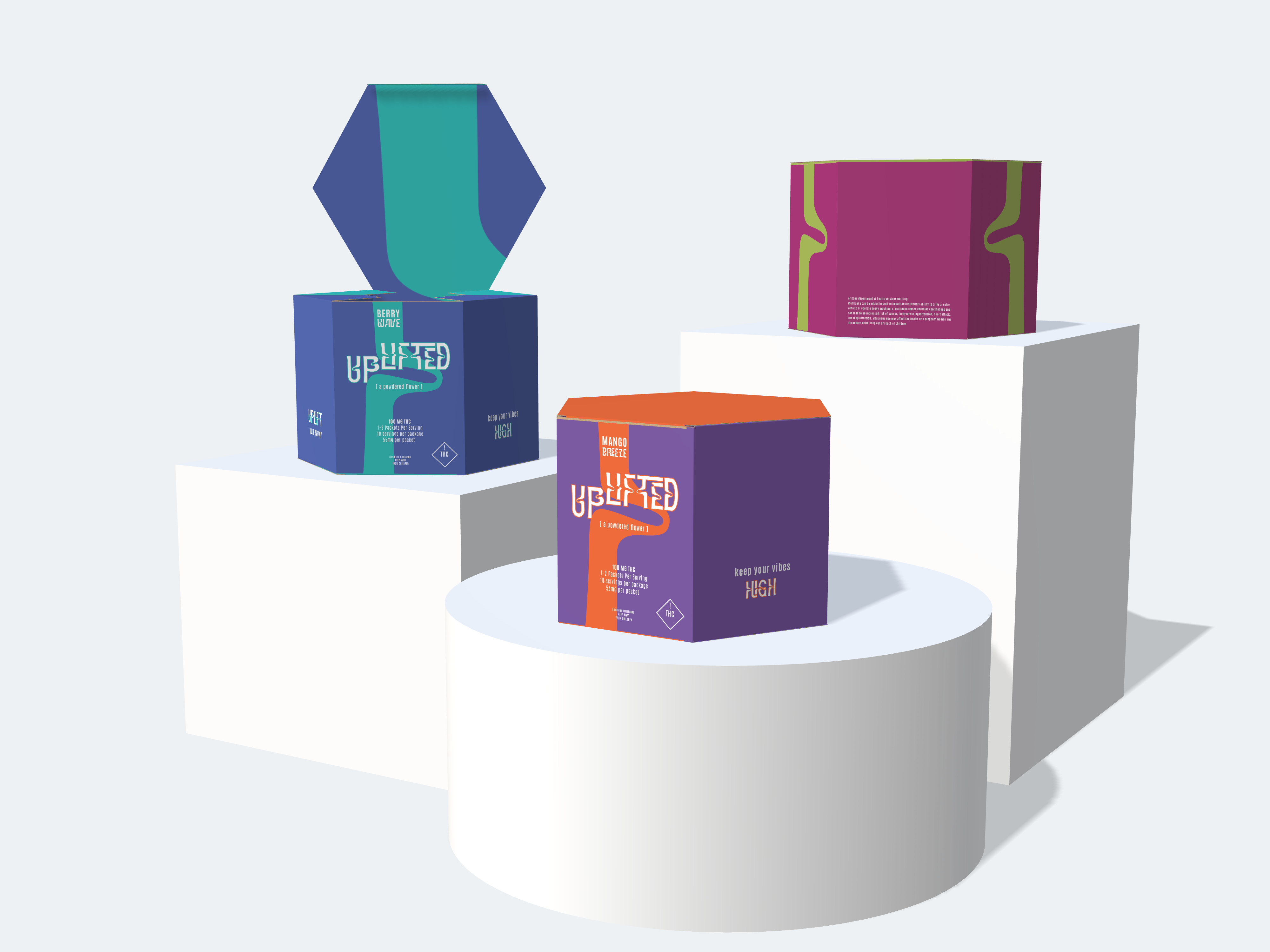
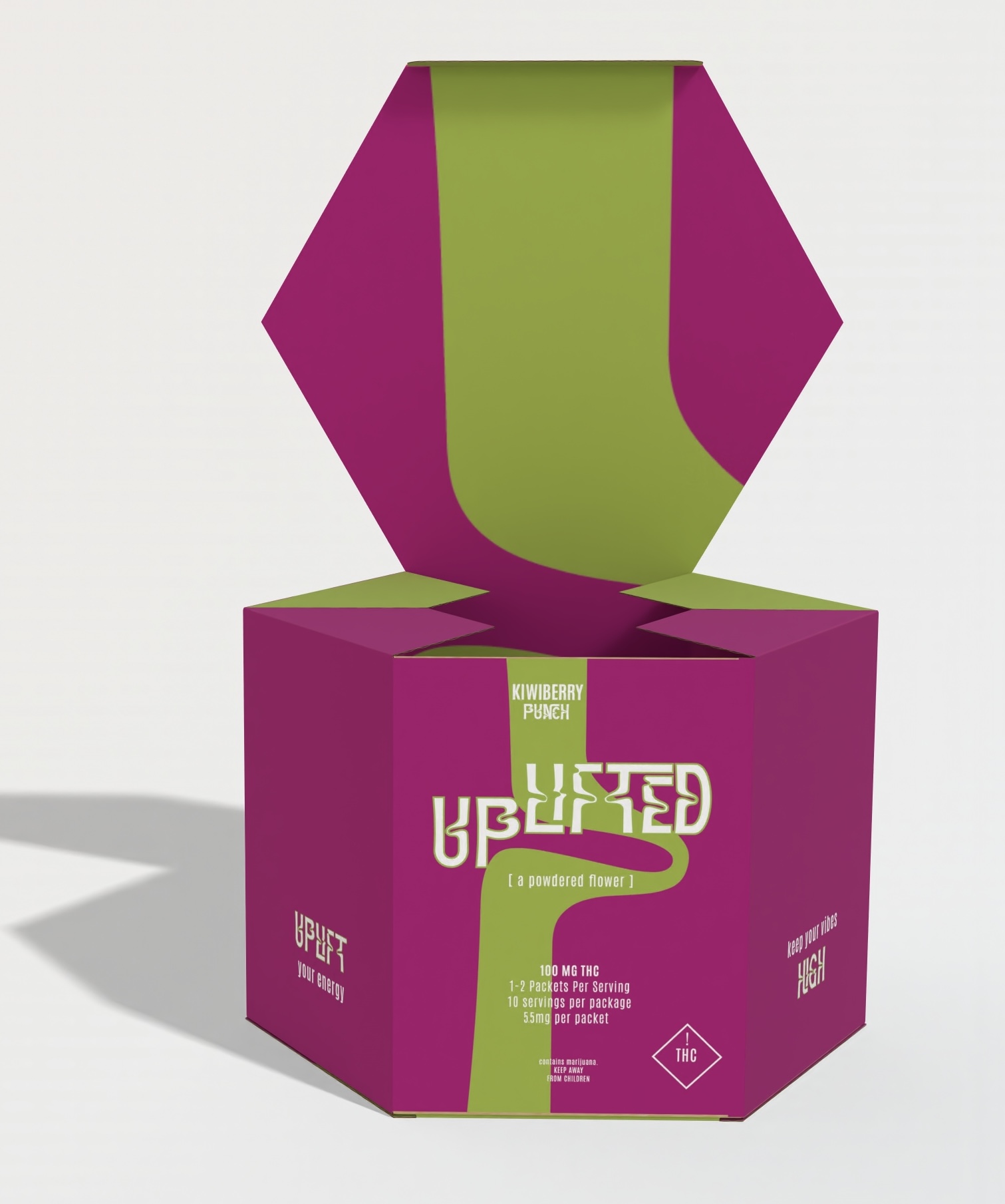
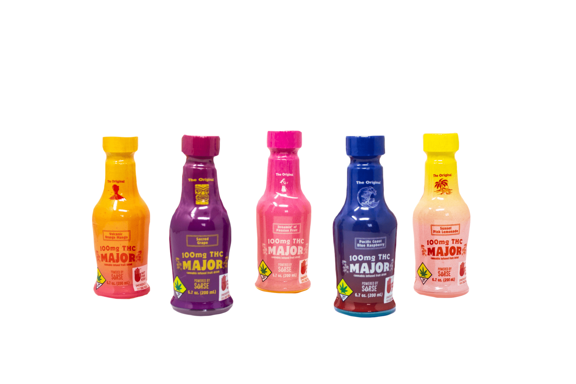
The brand positioning for this product ‘Uplifted’ is for anyone 21 and up looking to indulge in cannabis products in a discrete and convenient way. The original brand was not working well, so I re-designed the packaging. I changed the entirety of how the product is consumed to a powder THC drink. The idea behind this product is convenience. Instead of a liquid drink that ‘Powered by Sorse’ is I revamped it to be a powder packet that you can just add water to. {You will see the old product design at the end of the gallery slides}
McKnacks
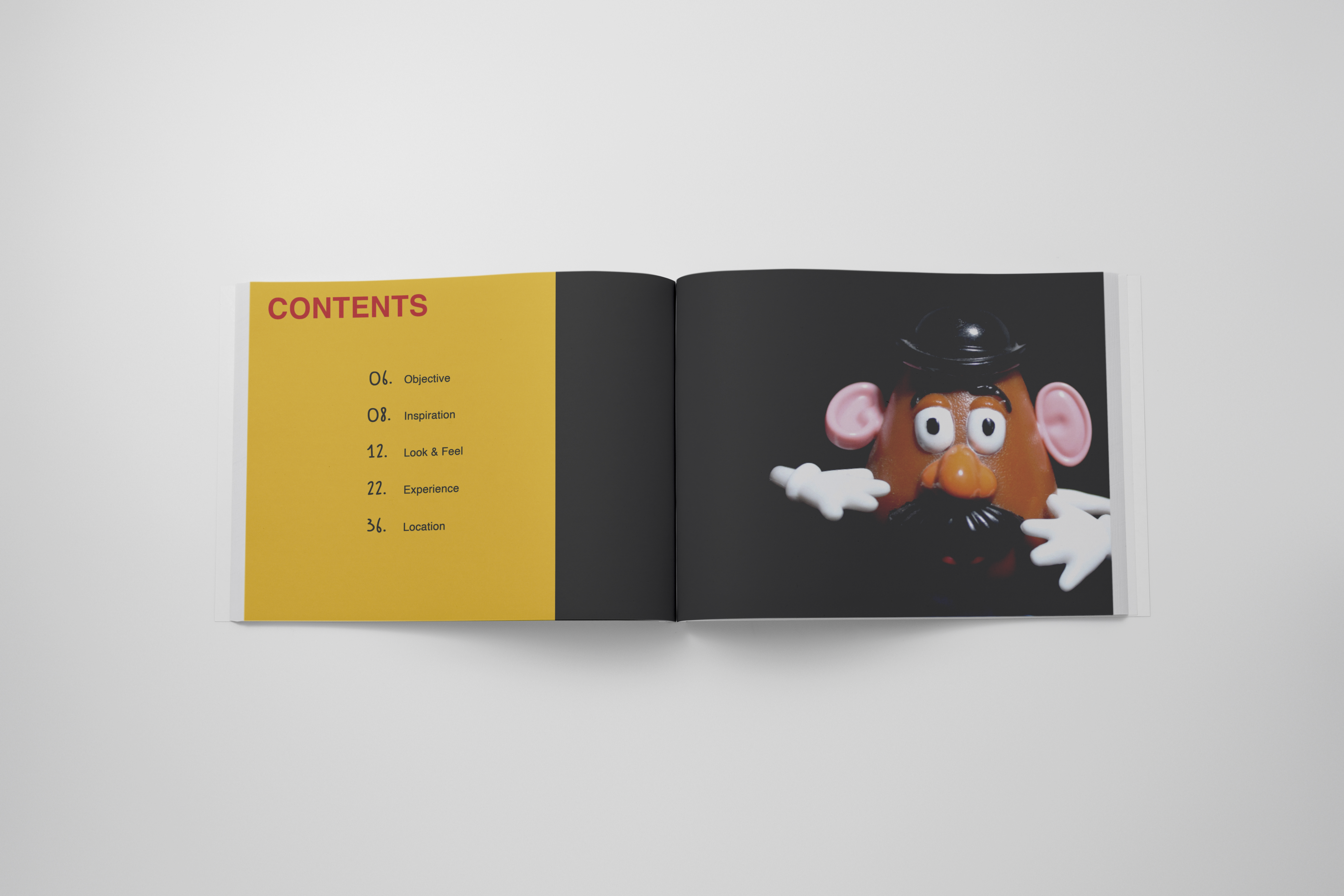
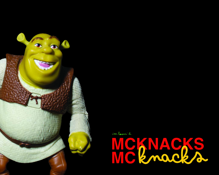
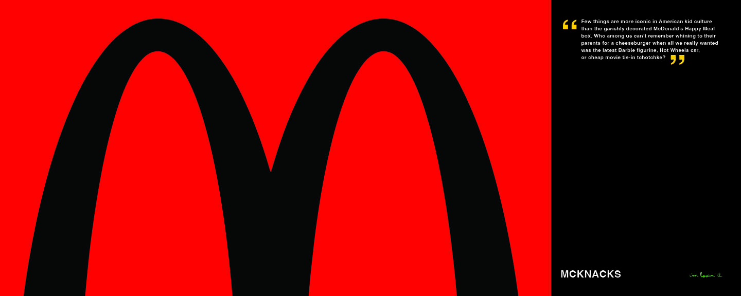
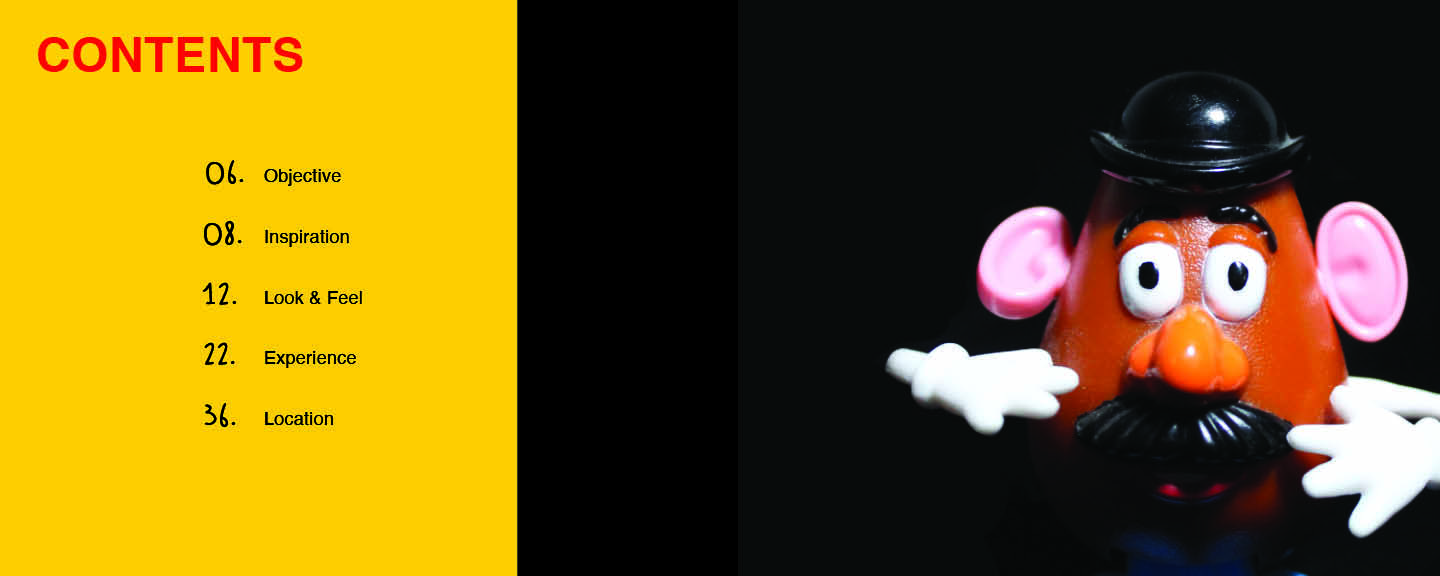
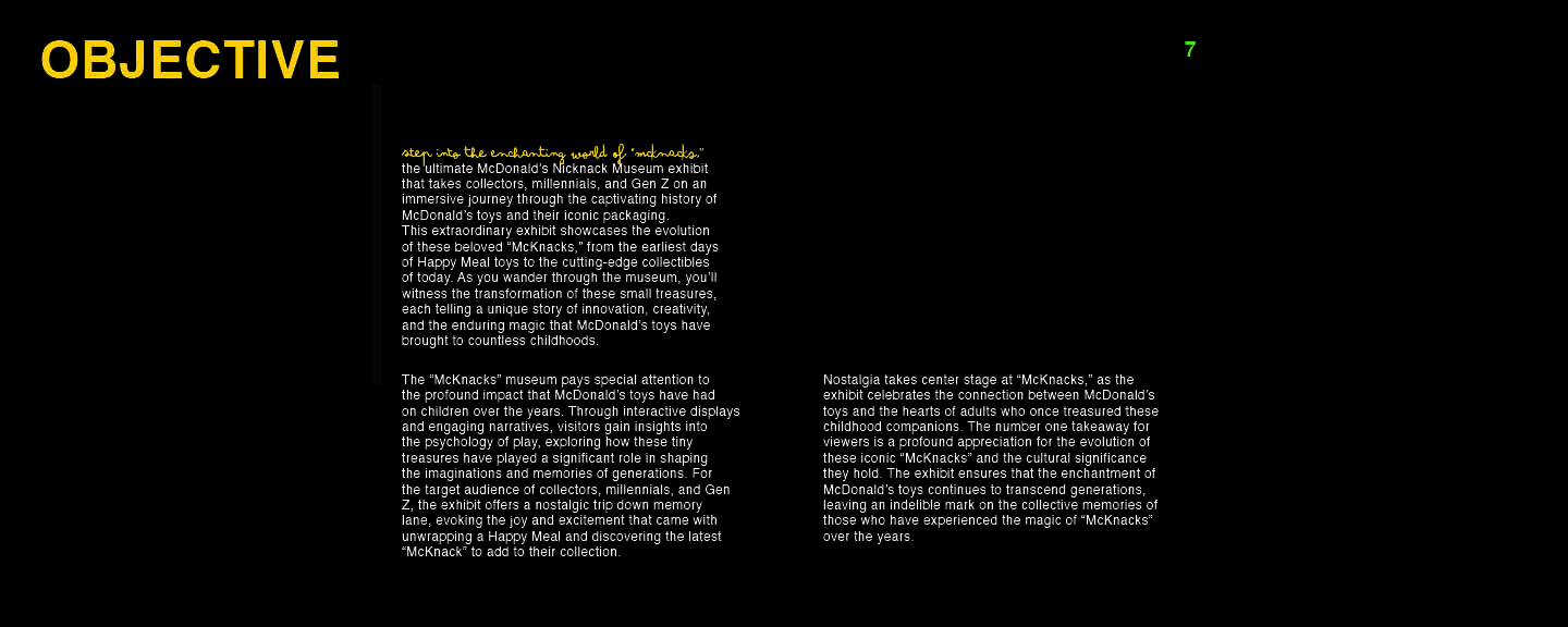
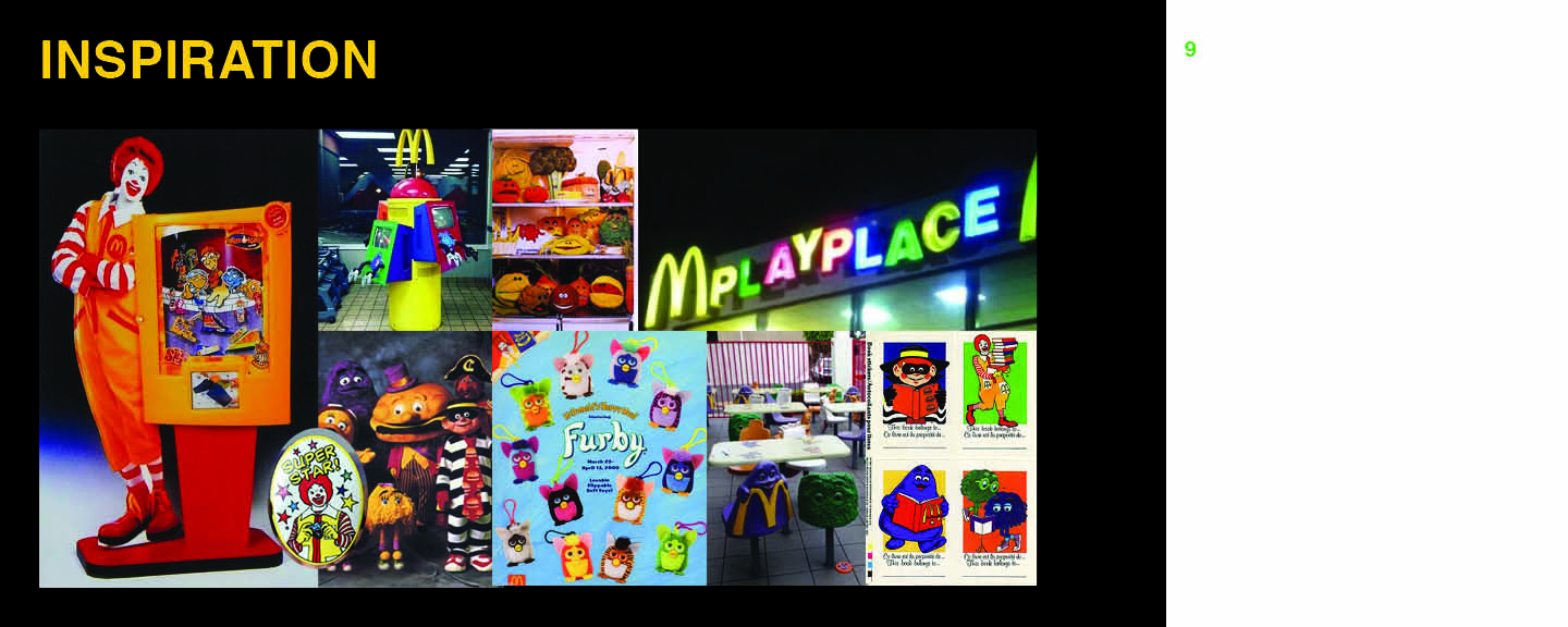
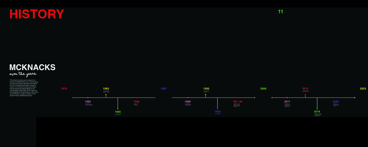
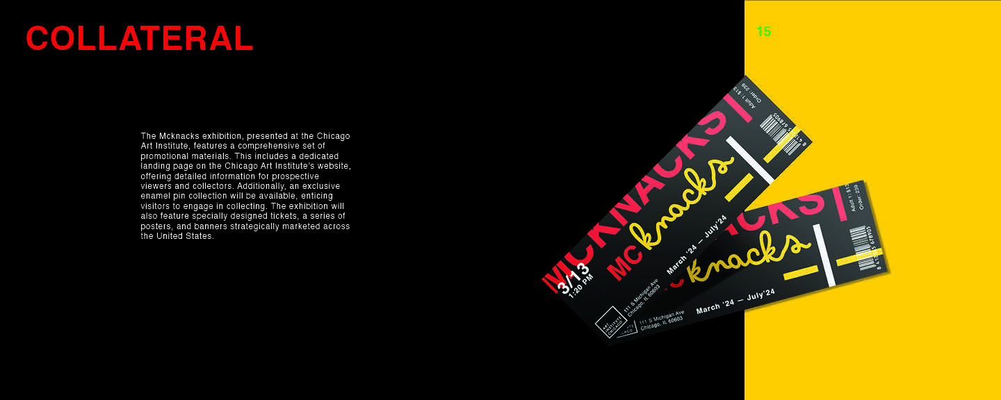
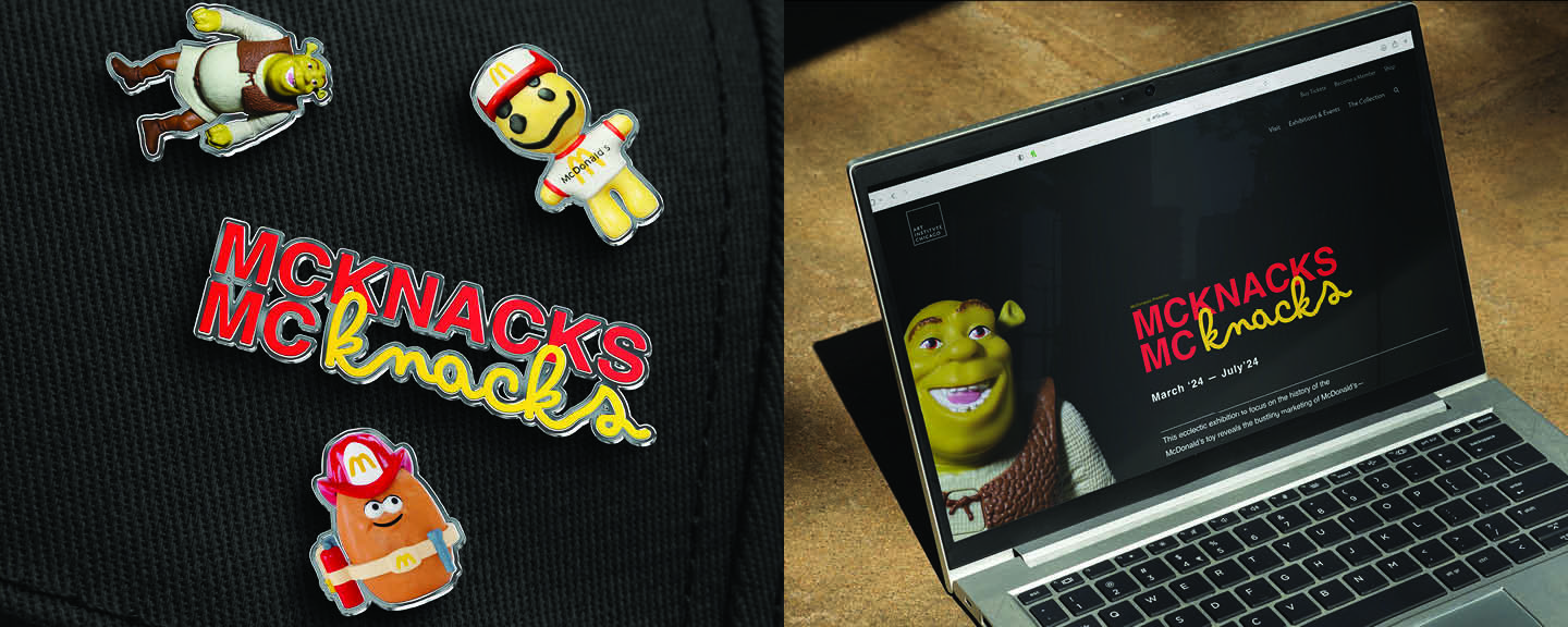
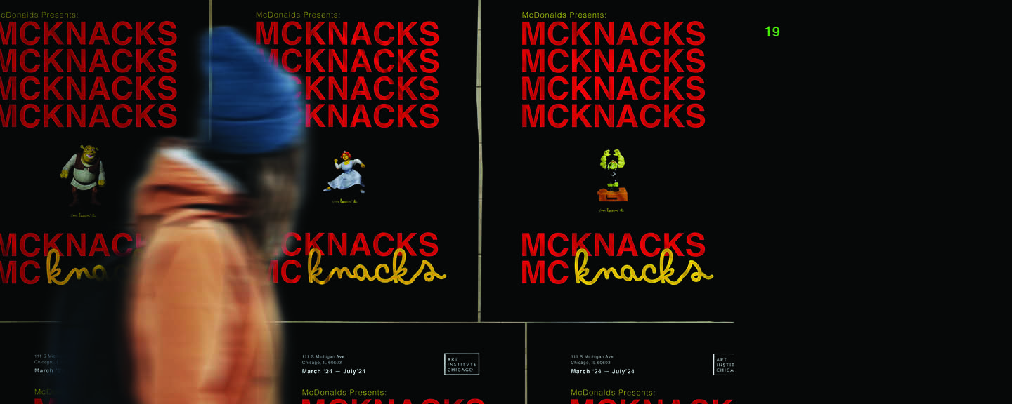
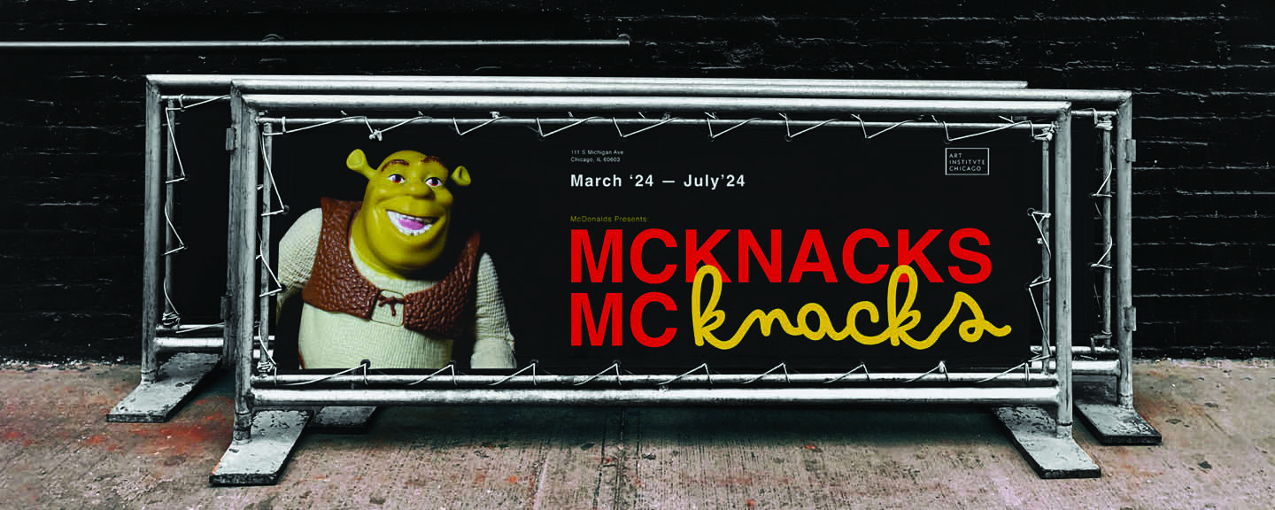
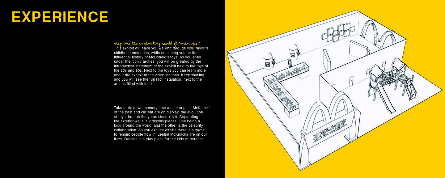
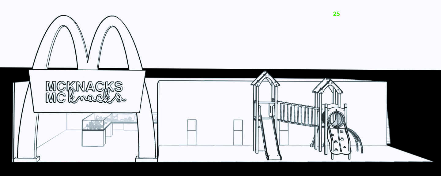
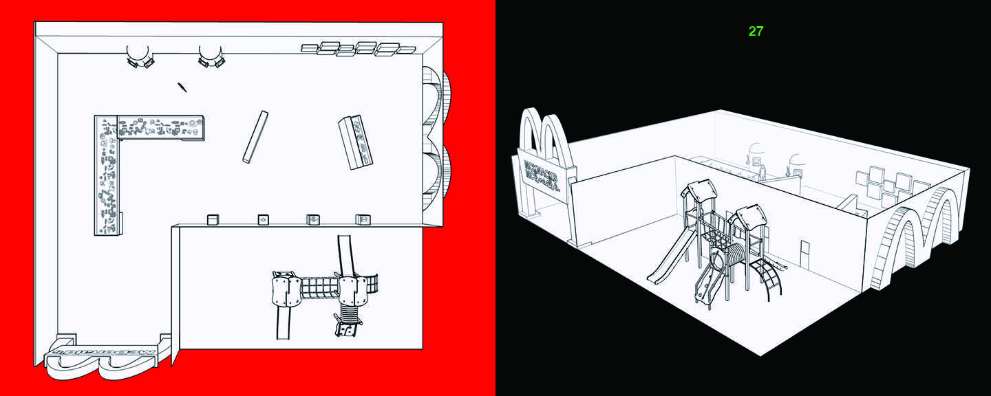
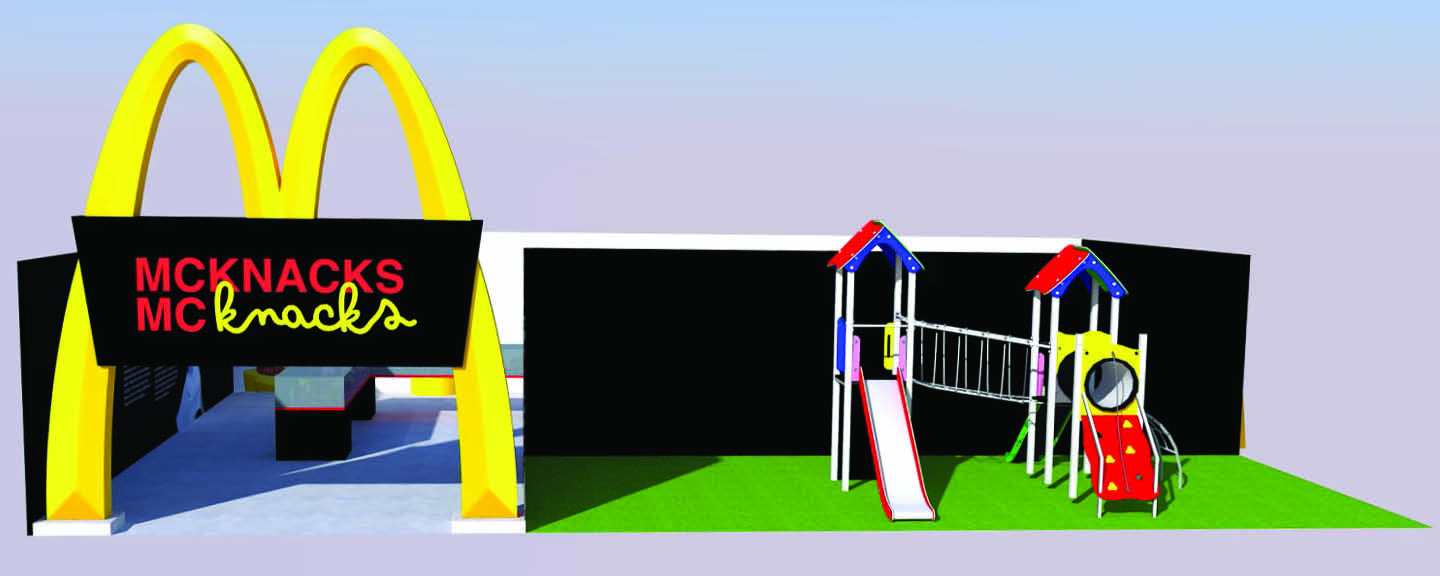
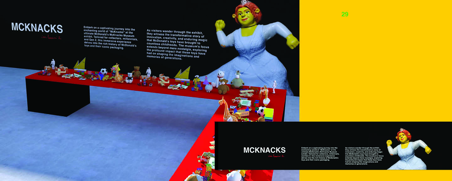
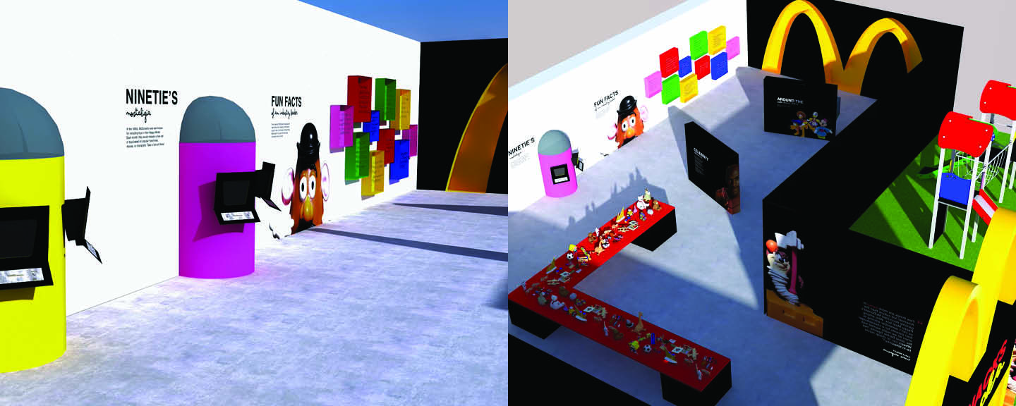
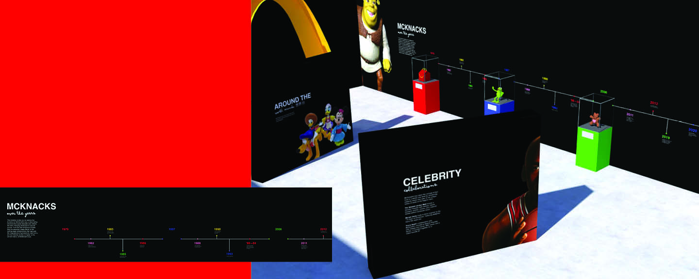
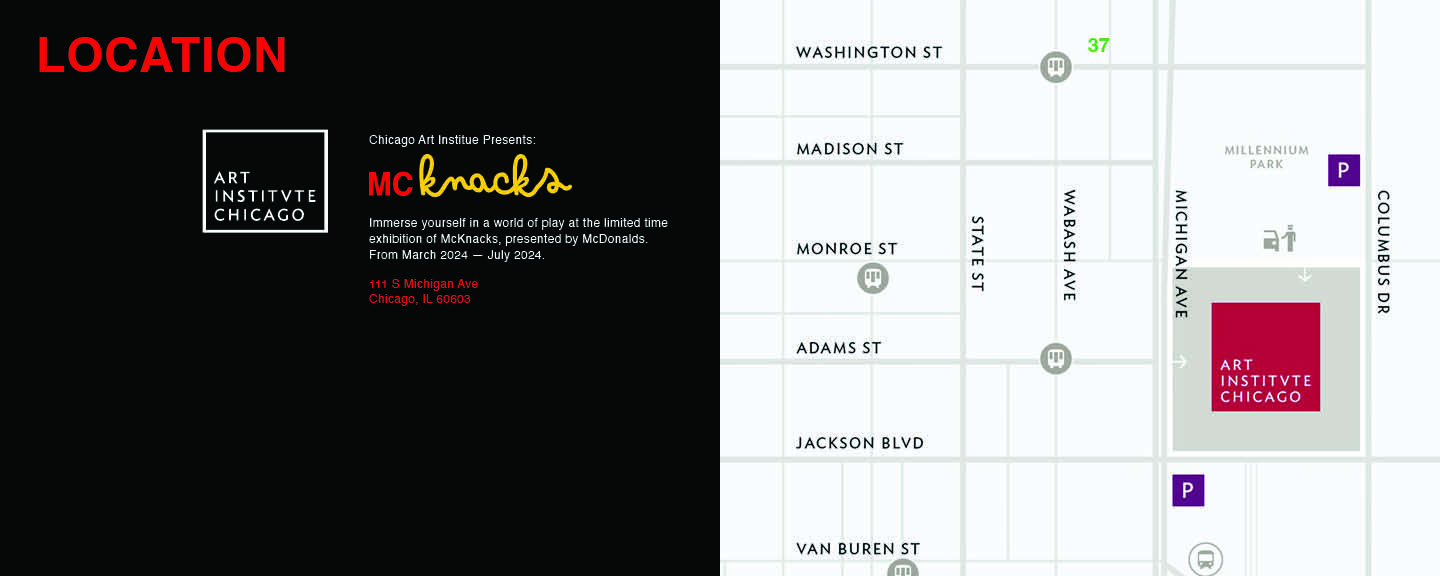
McKnacks is a pop-up design inspired by vintage McDonald’s toys. This project consists of a 3-D rendered digital exhibit design, book design, and possible rendered collateral for the exhibit. This project was inspired by bringing a youthful joy back into adulthood. As we get older we all search for things to do that bring back nostalgia, and the hope for this pop-up exhibit was exactly that!
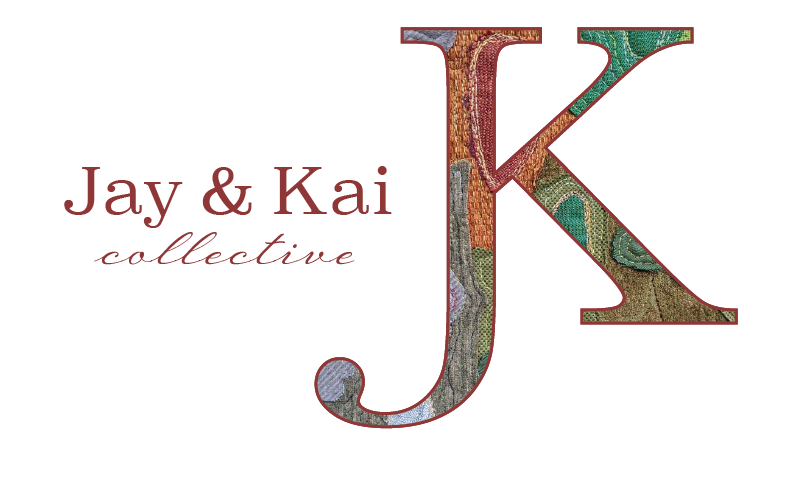
Jay & Kai Collective
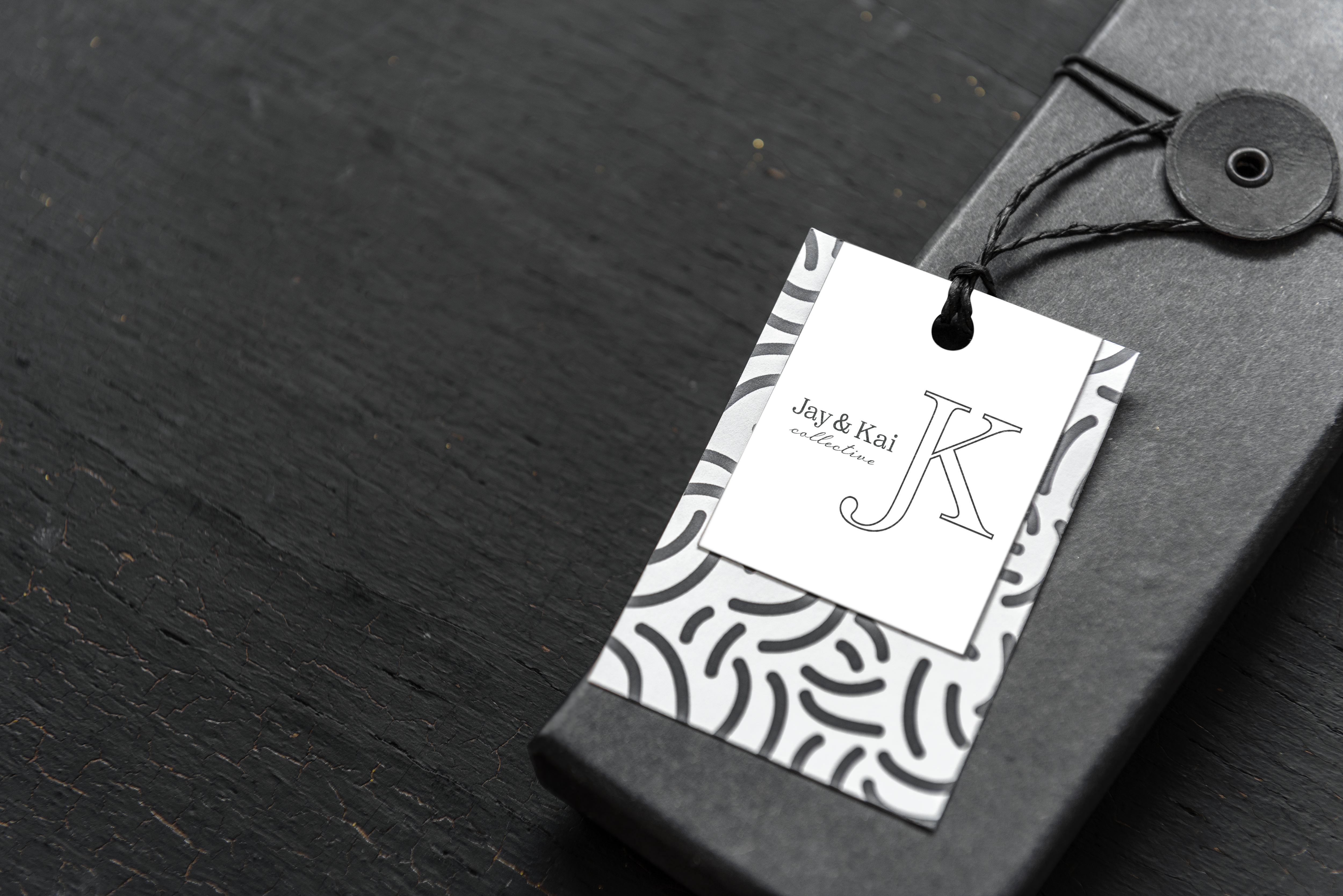
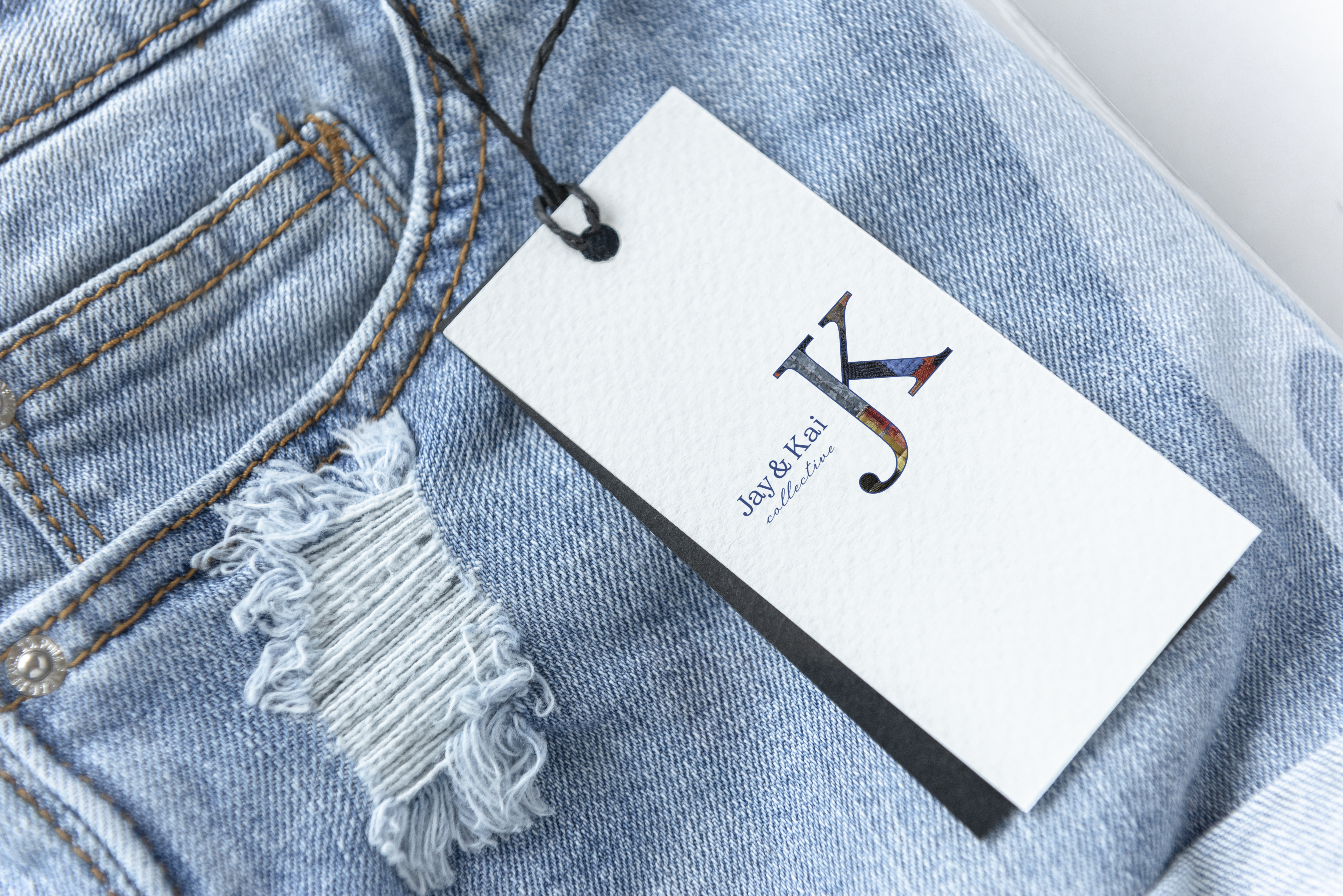
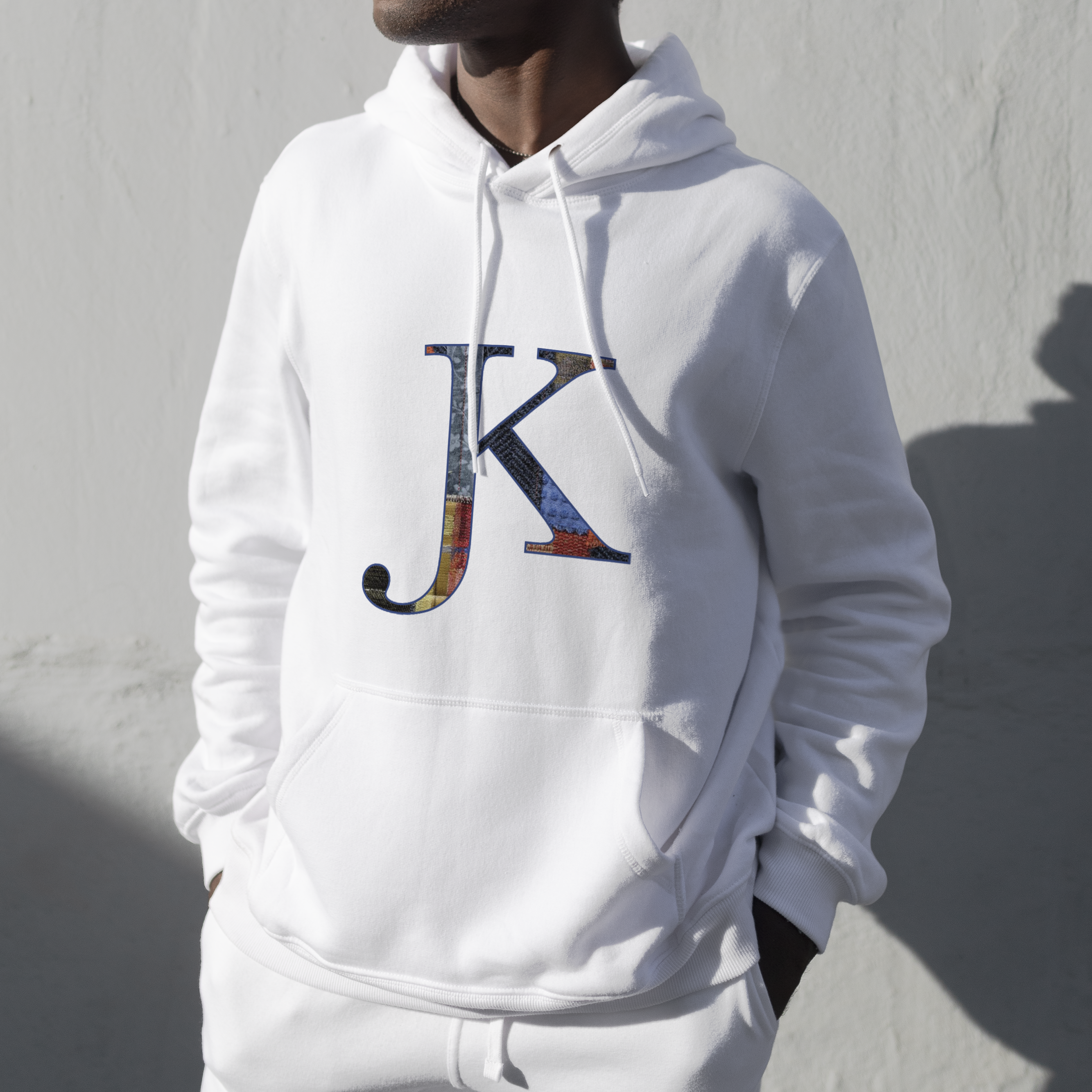
Jay & Kai Collective is a vintage clothing brand resell. The inspiration behind this project is different textiles of fabric being quilted together from different vintage gems.
Horses for Humans
A freelance project for a non profit that offers equine assisted therapy for all ages in the entire Twin Cities area. This project means a lot to me because I grew up with horses, and even went to the owner of this now non profit’s horse camp when I was younger.
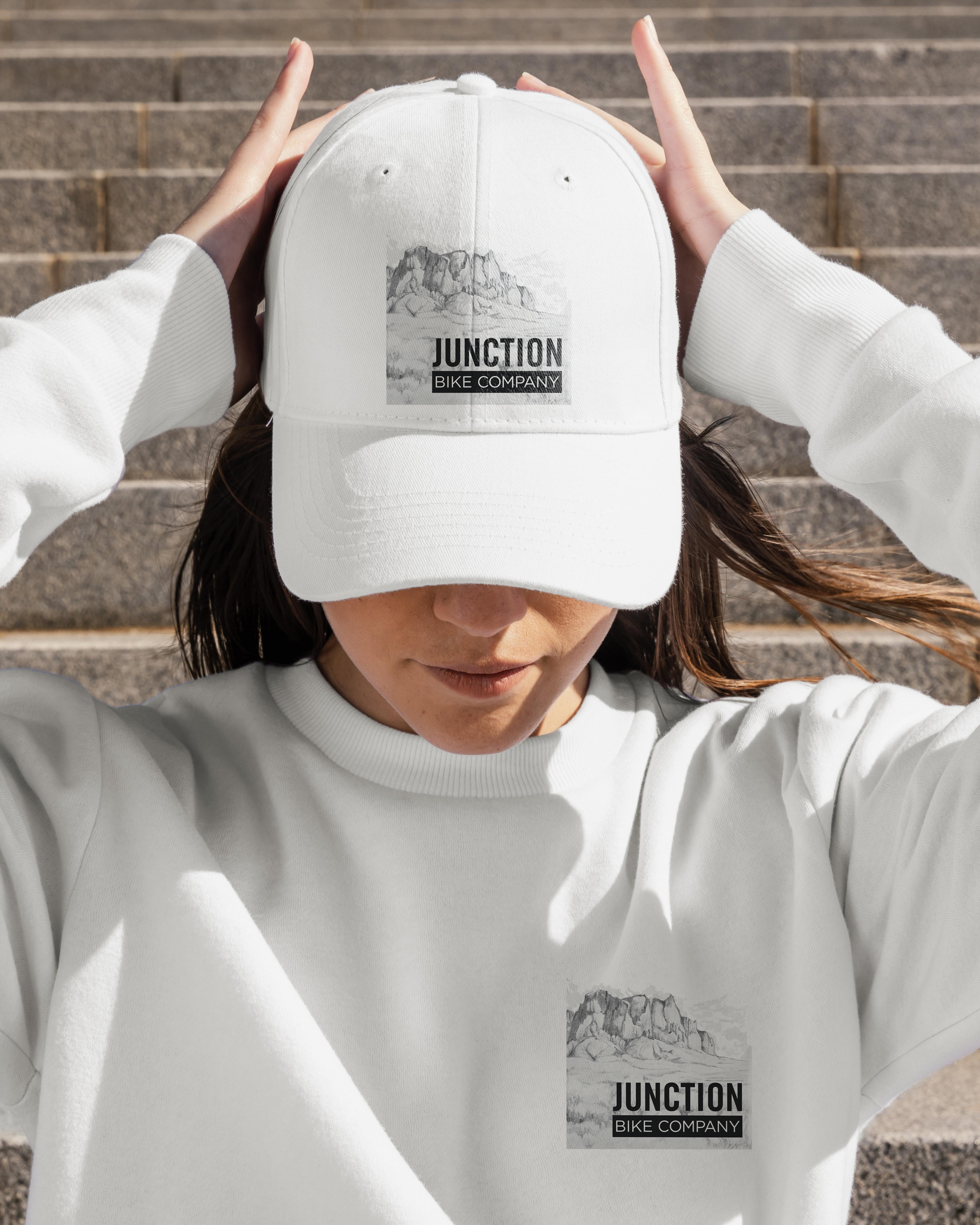
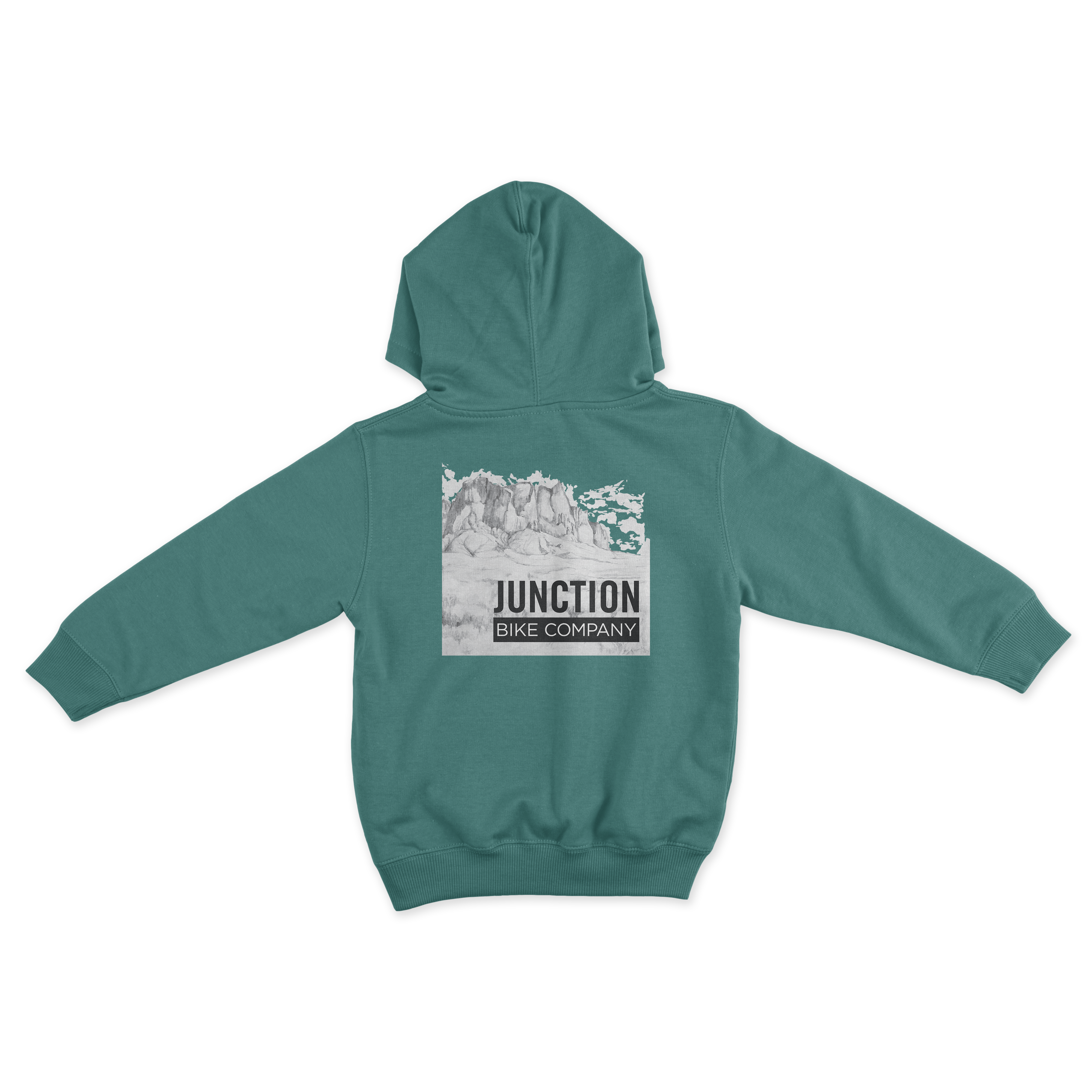
Junction Bike Company
Junction Bike Co wanted a logo with Superstition Mountains since that is where their company is focussed. This is a textured image created in Illustrator with image trace tool and clipping masks!
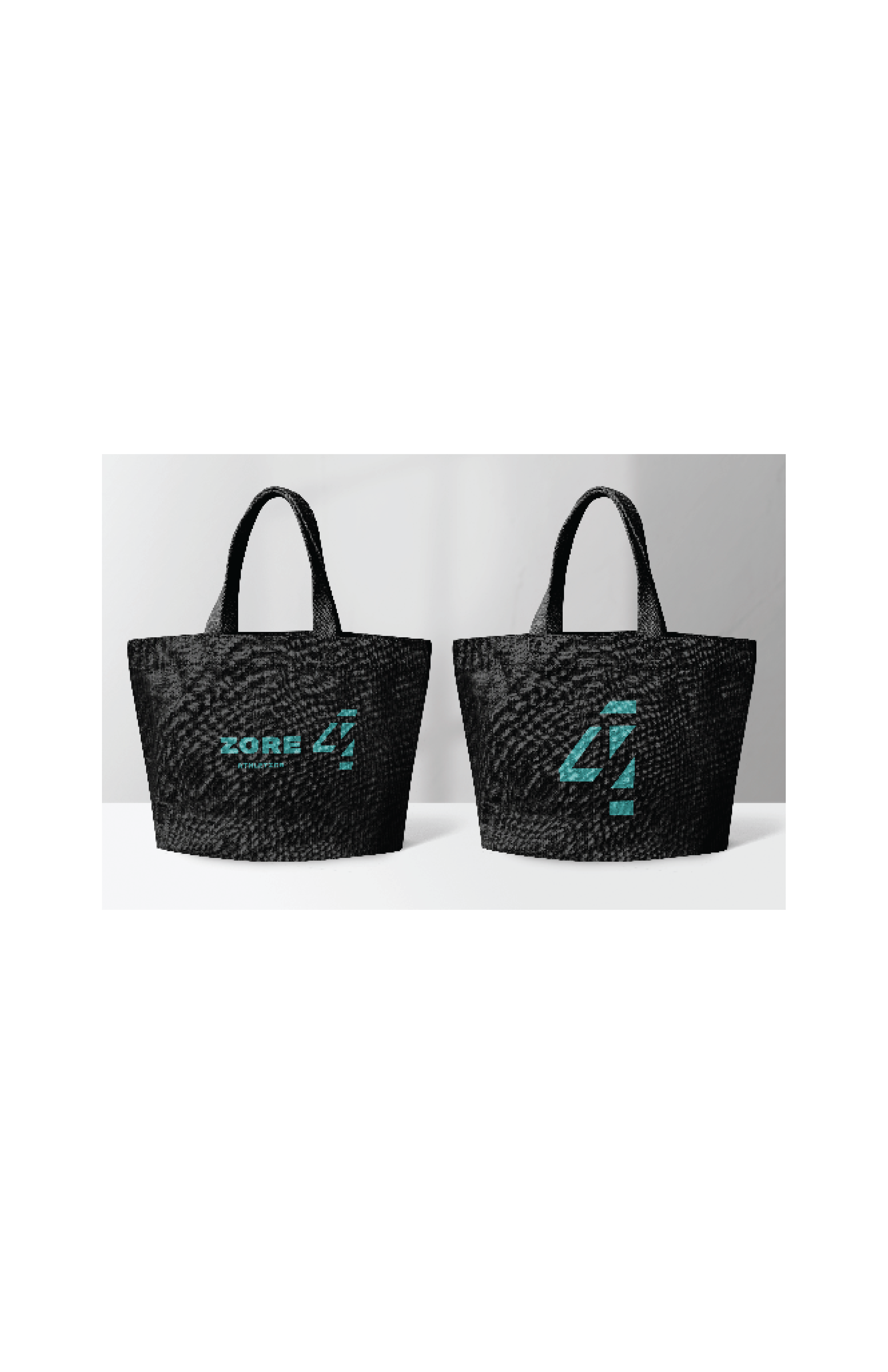
Zore
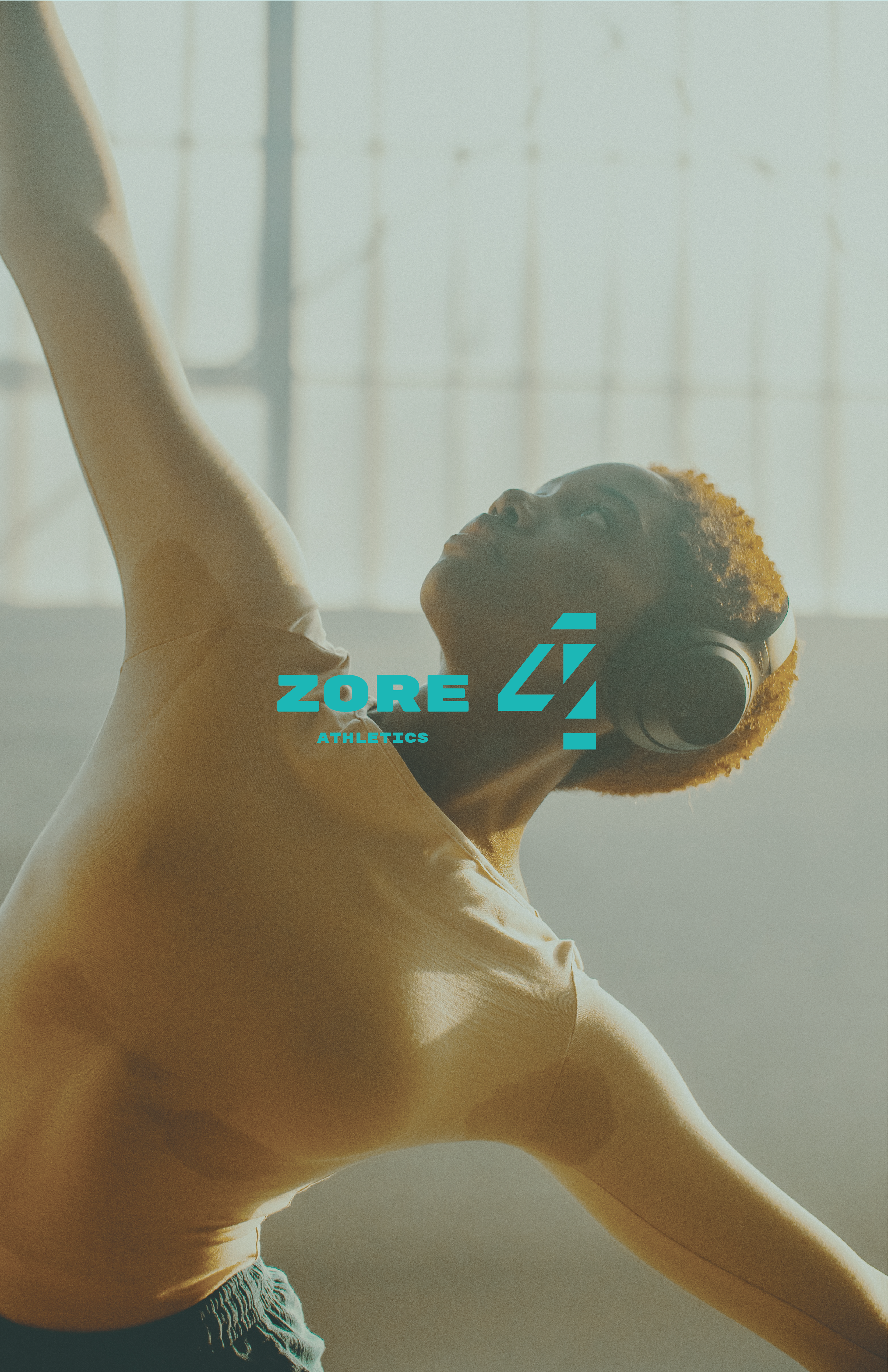
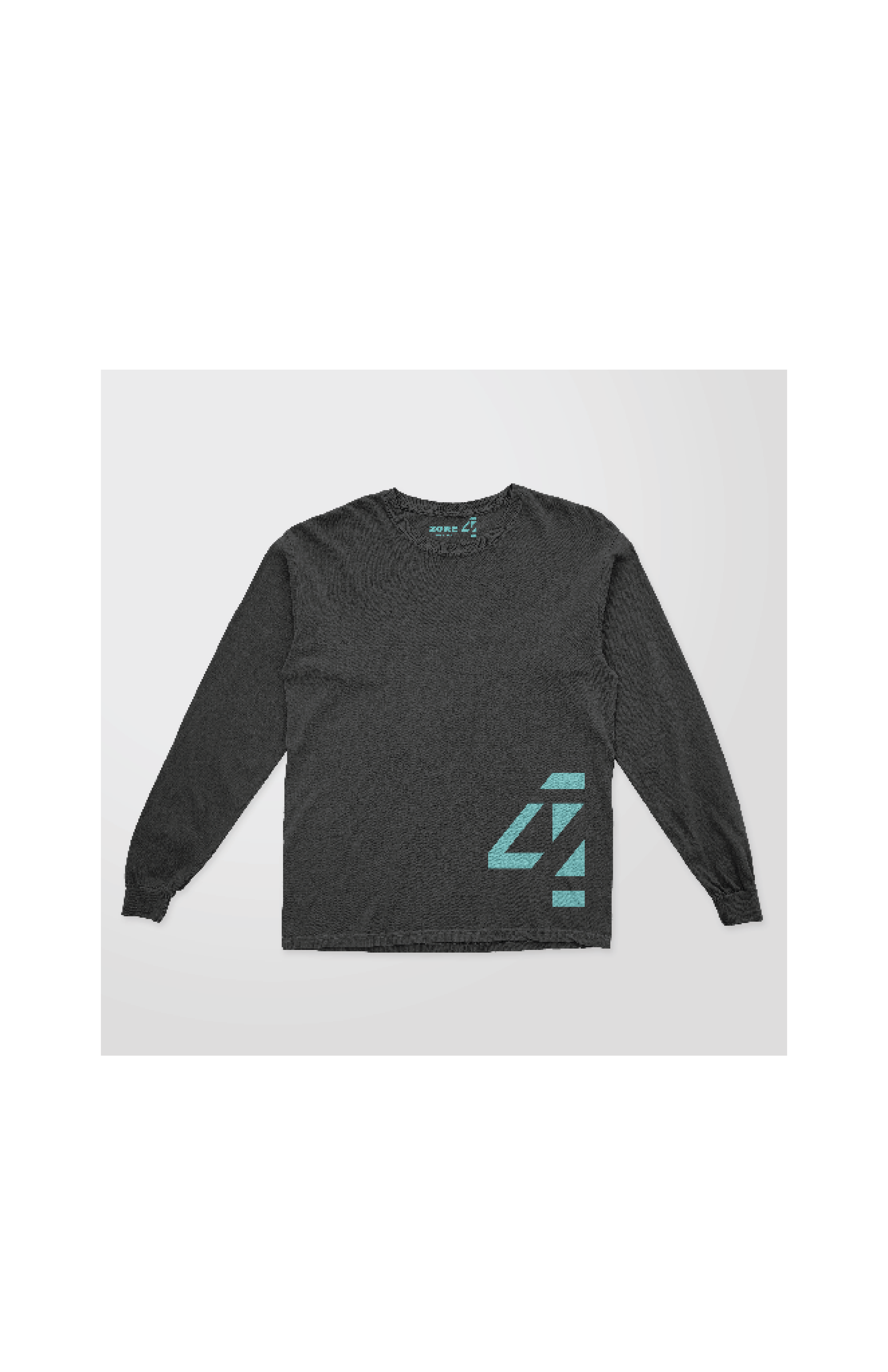
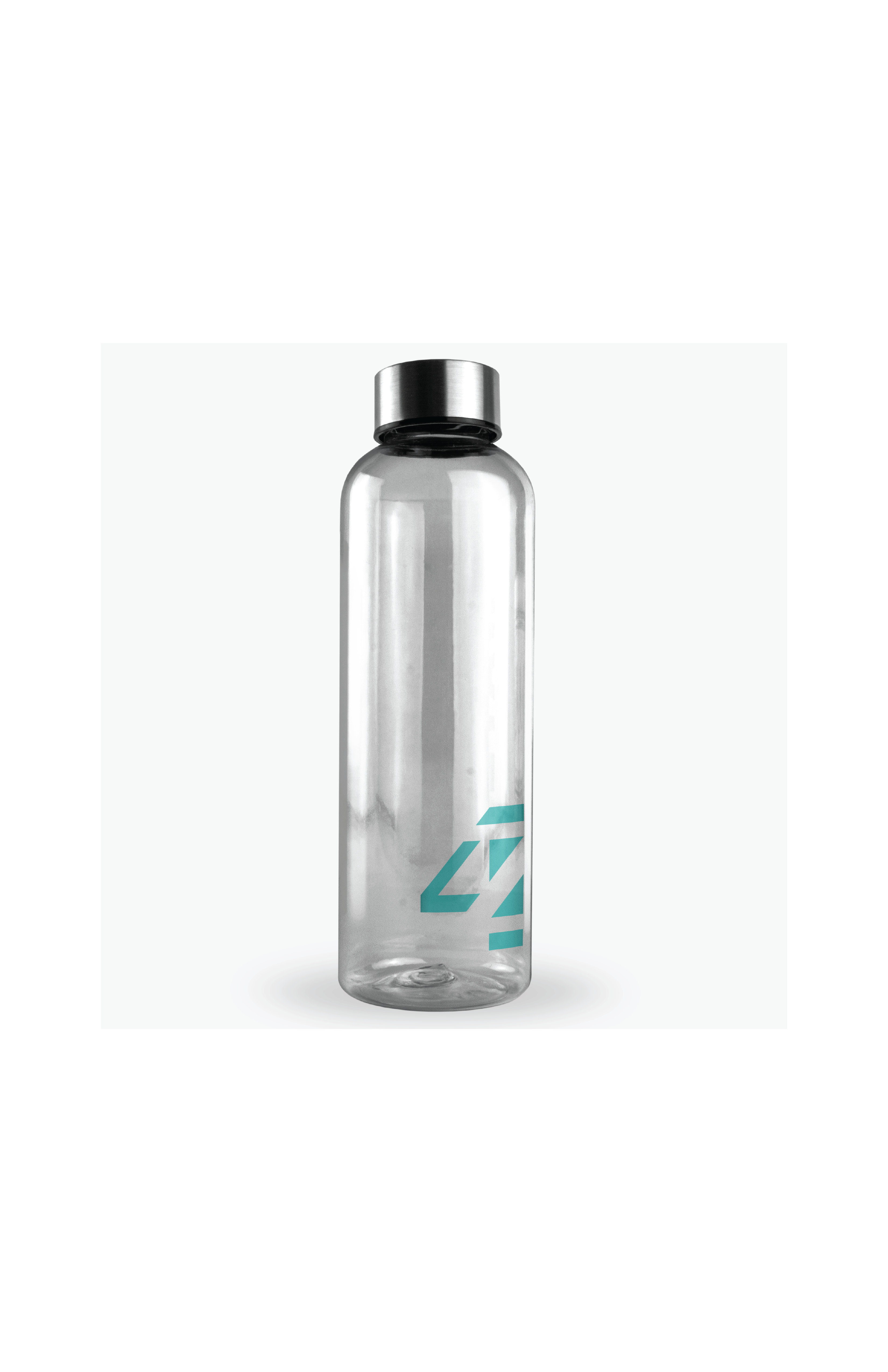
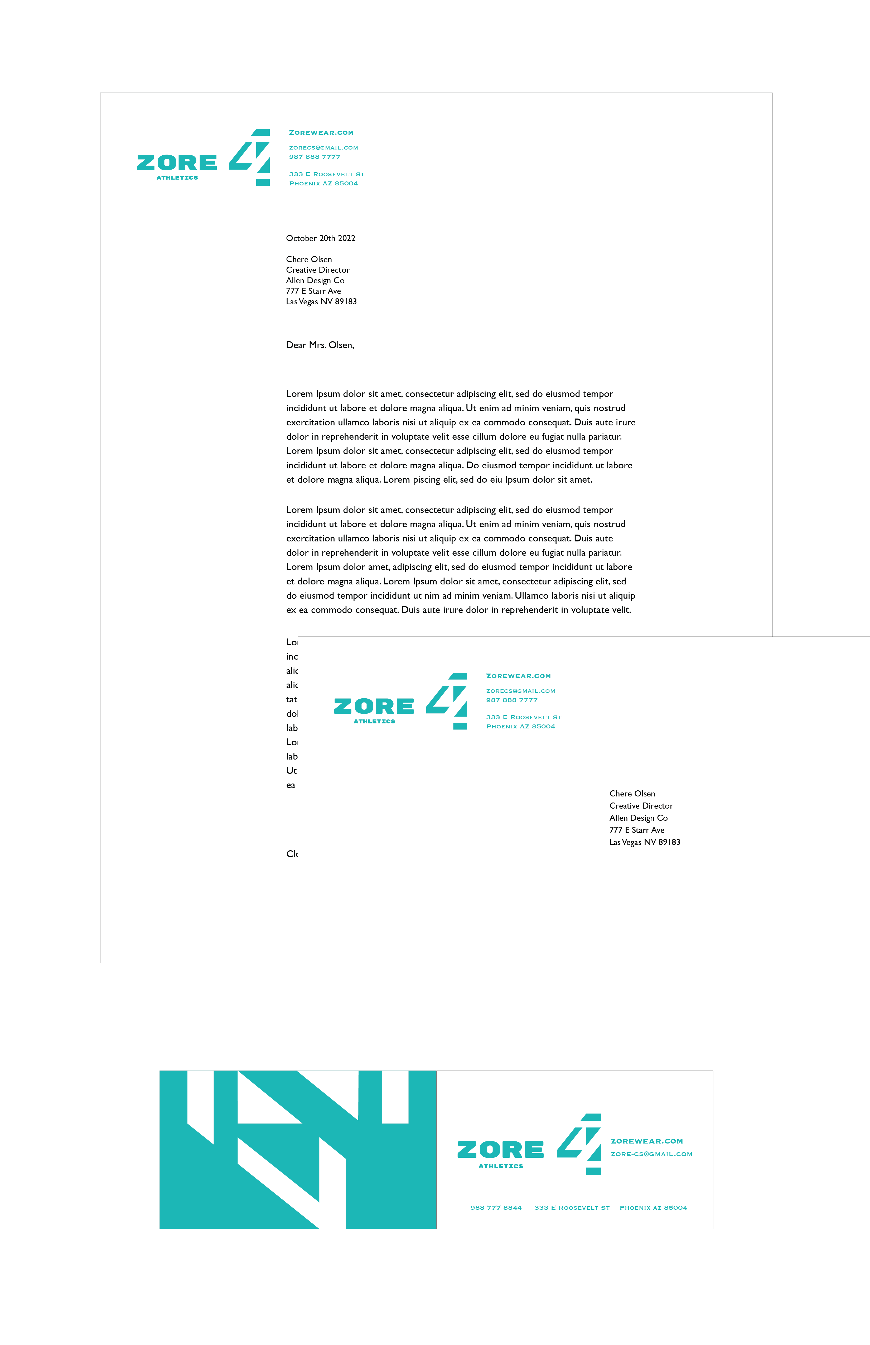
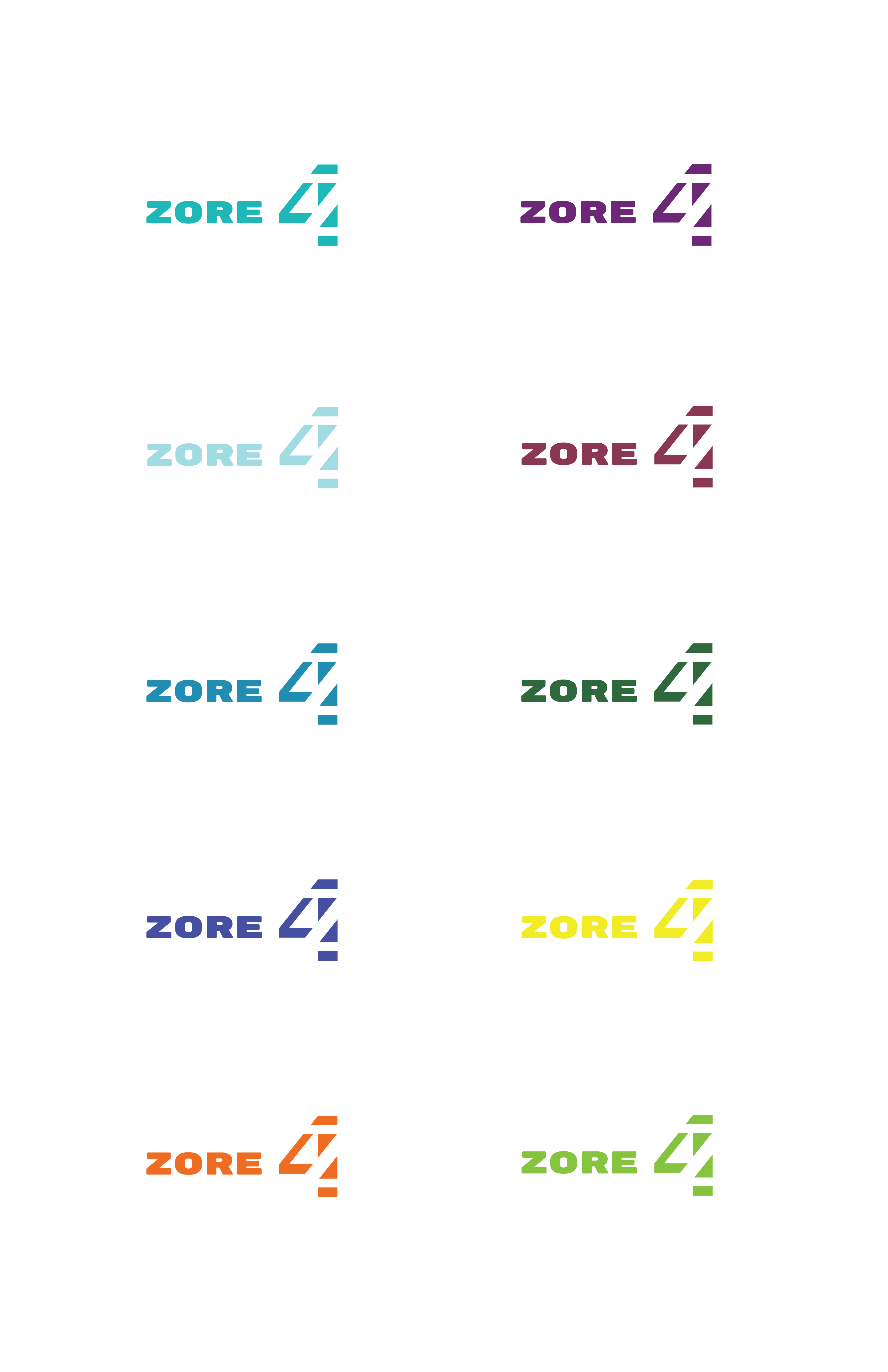
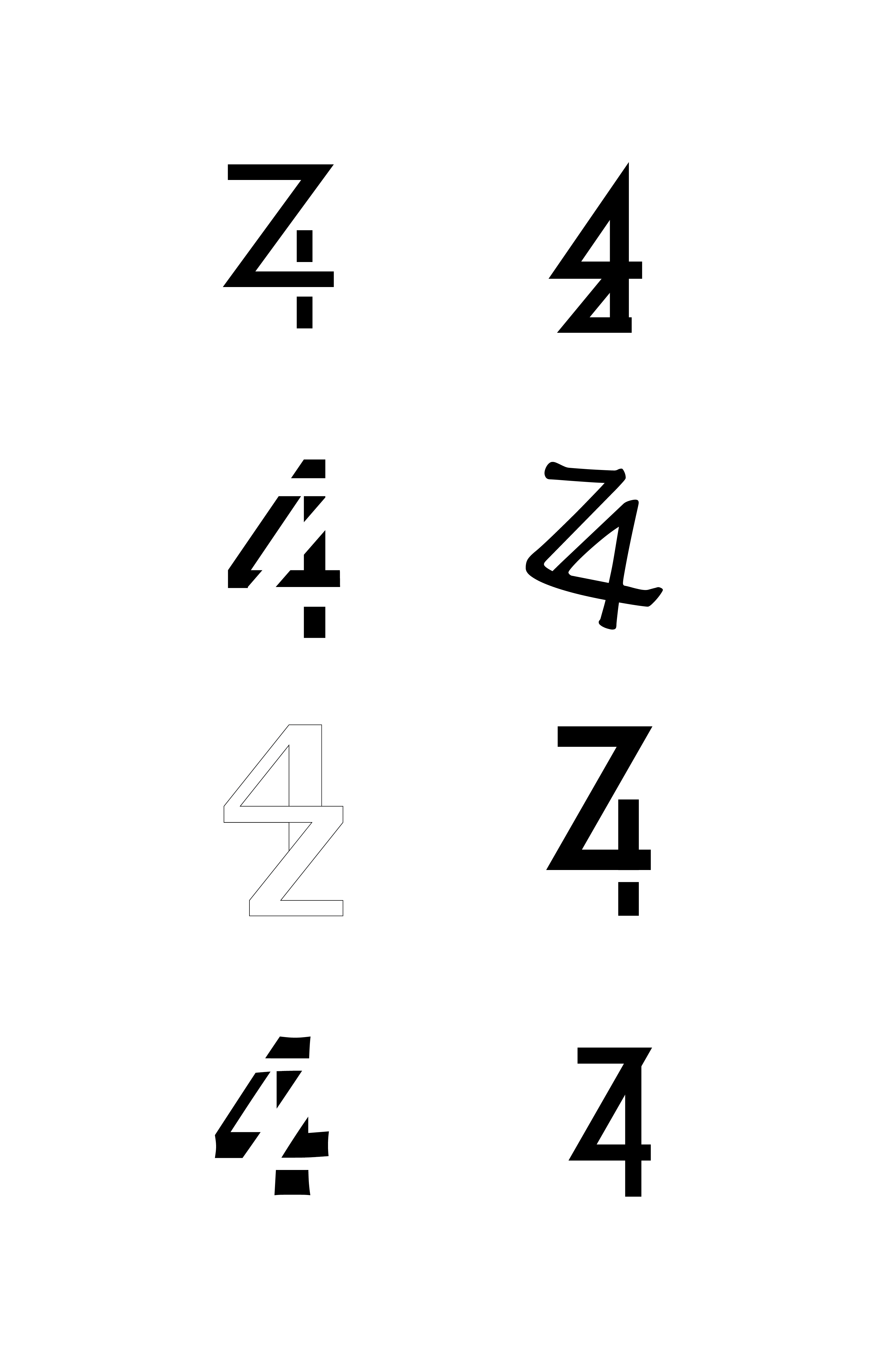
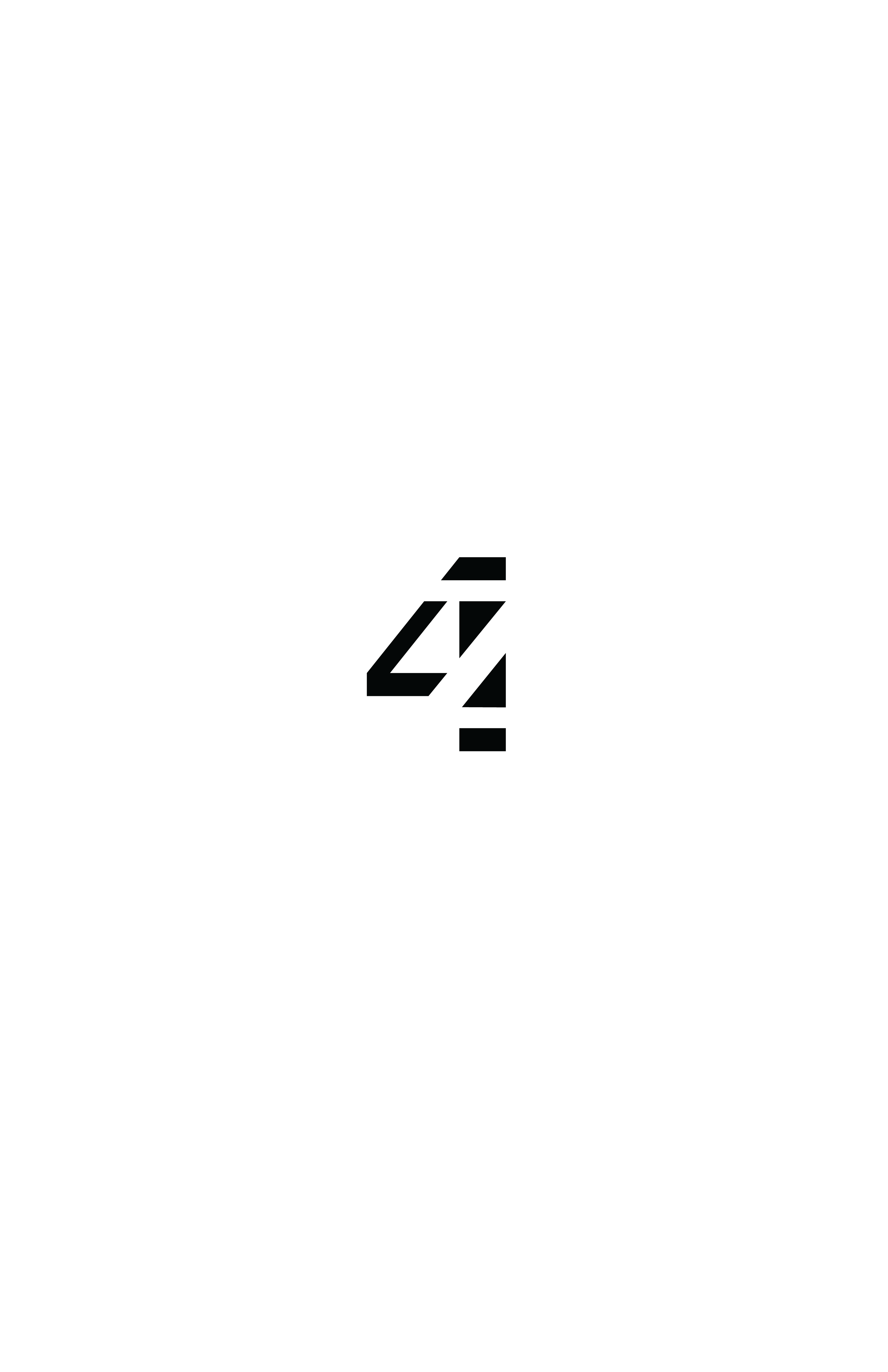
Zore athletics is a brand created with the letter 4 and z. This brand was aimed for active people, who like to ezplore, and push limits on every day standards.
